Role: UX Designer (Home Page)
Team: 1 Design Lead, 4 UX Designers
Timeline: 11 weeks (September – December 2023)
Tools: Figma
01. Overview
Spotify is a leading digital music streaming service that houses millions of songs and podcasts from artists around the globe. With its vast library of content, Spotify allows its users to listen to anything anywhere.
THE PROBLEM
Despite connecting its users to millions of songs and podcasts, the Spotify mobile app falls short in delivering personalized recommendations. It also fails to integrate existing social features and maintain consistency across the mobile and desktop versions, diminishing the overall user experience.
OUR SOLUTION
An app redesign that demonstrates feature parity across platforms, collects additional input from users to deliver more personalized recommendations, and builds upon existing social aspects to foster a sense of community for music lovers.
02. Understand
COMPETITIVE ANALYSIS
Our team looked at six of Spotify's biggest competitors: Apple Music, Amazon Music, Tidal, Pandora, YouTube Music, and SoundCloud. We took note of aspects like onboarding, ease of navigation, and any special features to see how they stack up against Spotify. Through examining each of their strengths and weaknesses, we discovered where Spotify is excelling and where it's lacking:
1. Most music streaming platforms have no social features or very limited sociability.
This makes Spotify unique in that it's partially a social media platform. Users can follow artists, see what their friends are listening to, and create collaborative playlists. However, some social aspects and statistics available on the desktop version are missing on mobile.
2. Spotify is lacking in its music discovery.
Other platforms have unique opportunities for users to express their preferences, such as Pandora's "tired of this track" option and the ability to react to songs with thumbs-ups and downs. While Spotify does have a (very short) onboarding process, there isn't much opportunity afterward for users to directly curate their recommendations.
USER INTERVIEWS
We conducted 12 interviews to gain an understanding of Spotify's user base. Questions were structured around identifying likes and dislikes, listening preferences, and pain points while using the app. To organize our findings, we used affinity mapping and clustered answers into several themes:
03. Synthesize
DEFINING INSIGHTS
Now that we had a clear understanding of users' habits and frustrations, we narrowed our findings down to three key insights that we planned to address in our redesign:
1. People find Spotify’s music recommendations to be inconsistent and hit-or-miss, resulting in them gravitating toward their own playlists rather than Spotify’s recommended playlists.
2. While the social aspect of Spotify may not rank as the highest priority for users, social features are still valued and appreciated.
3. People seek a uniform and consistent experience between the Spotify mobile app and desktop version, primarily in the form of feature parity.
USER PERSONAS & JOURNEY MAPS
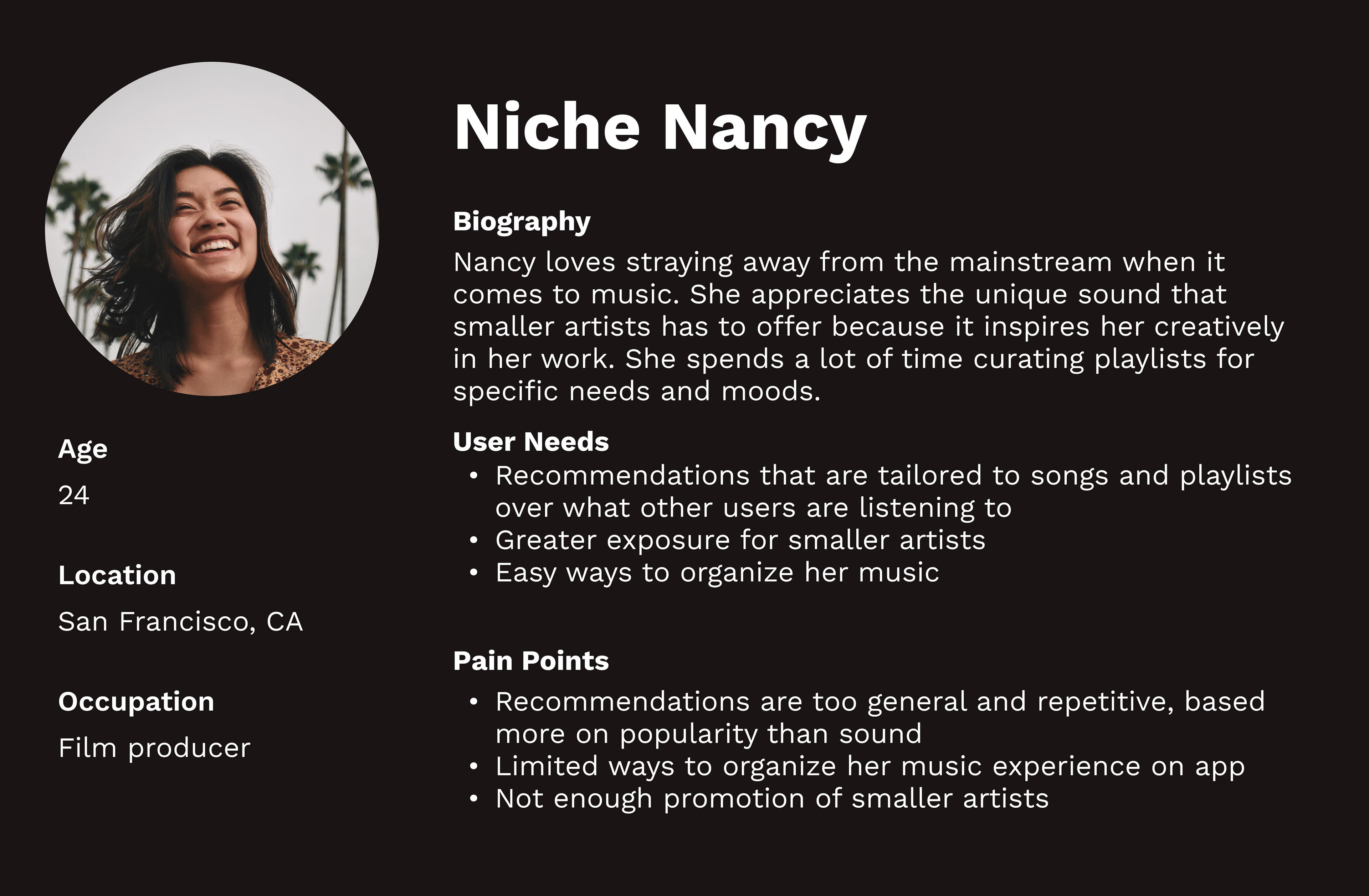
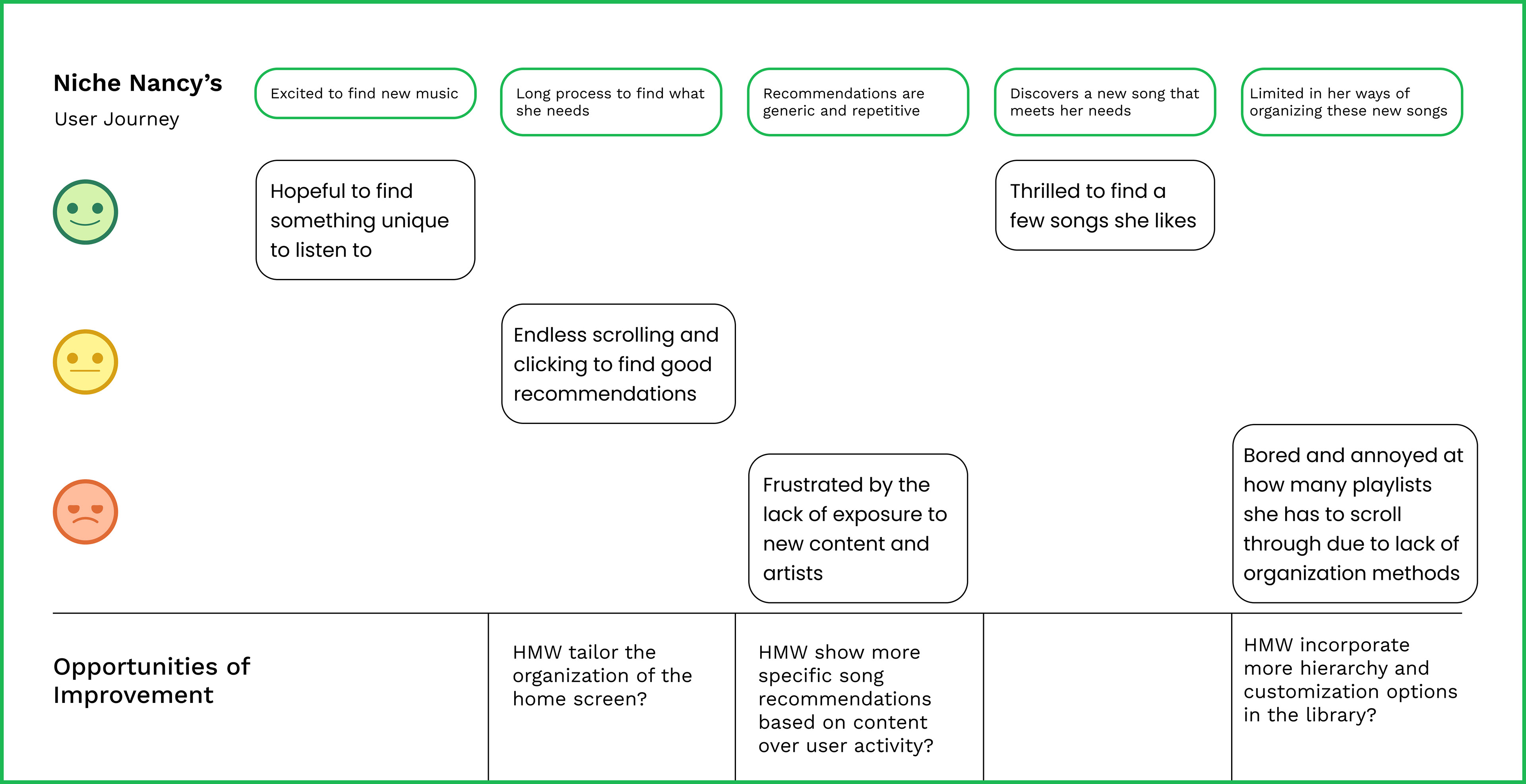
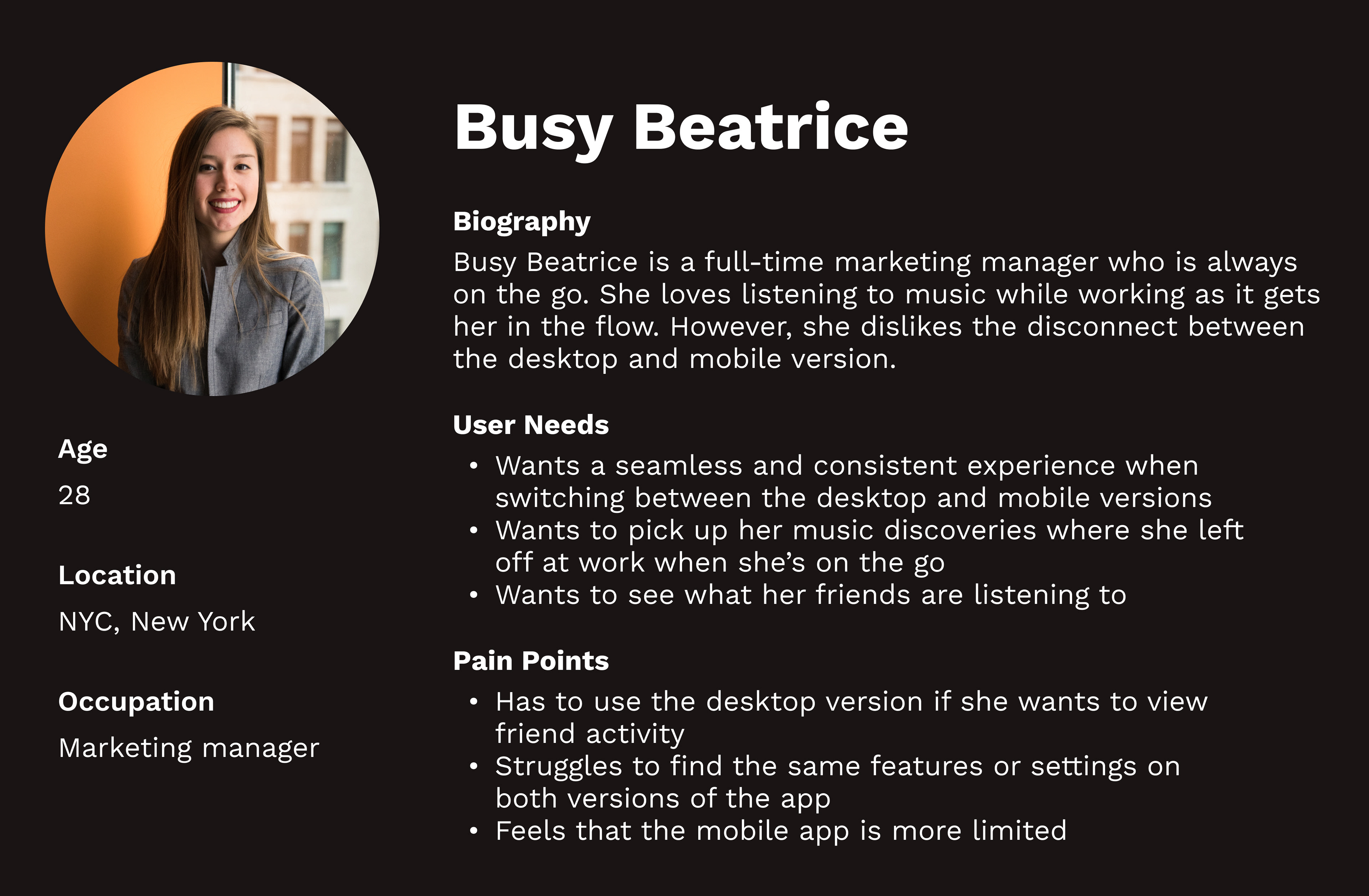
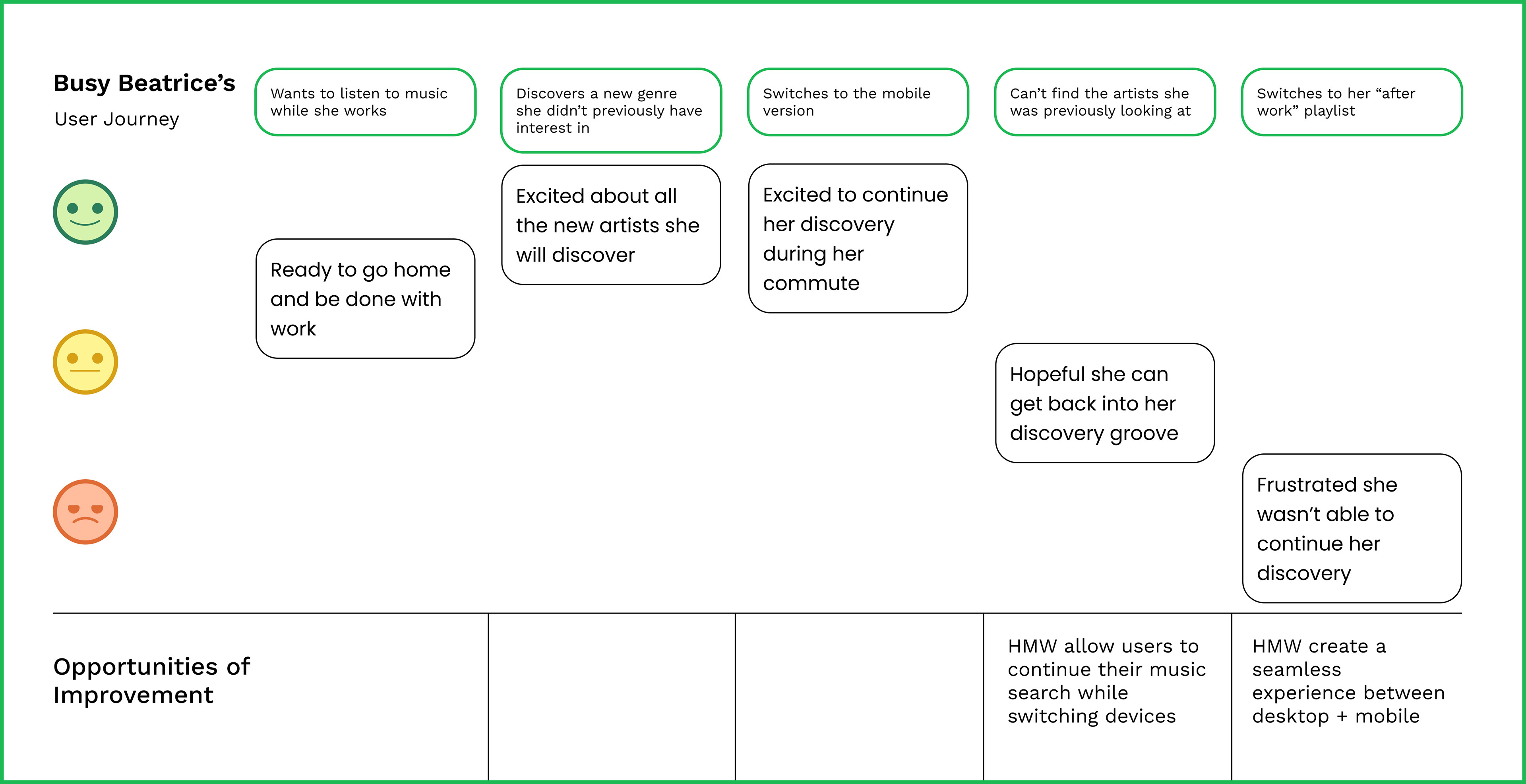
Using the insights we derived from our interviews and competitive analysis, we created user personas that reflected real Spotify listeners' needs and pain points. We also outlined journey maps that these users would follow, leading to "how might we" questions that arose at different stages of their experiences. This served as a starting point for our team to brainstorm solutions to common frustrations.
04. Ideate
LOW-FIDELITY SKETCHES
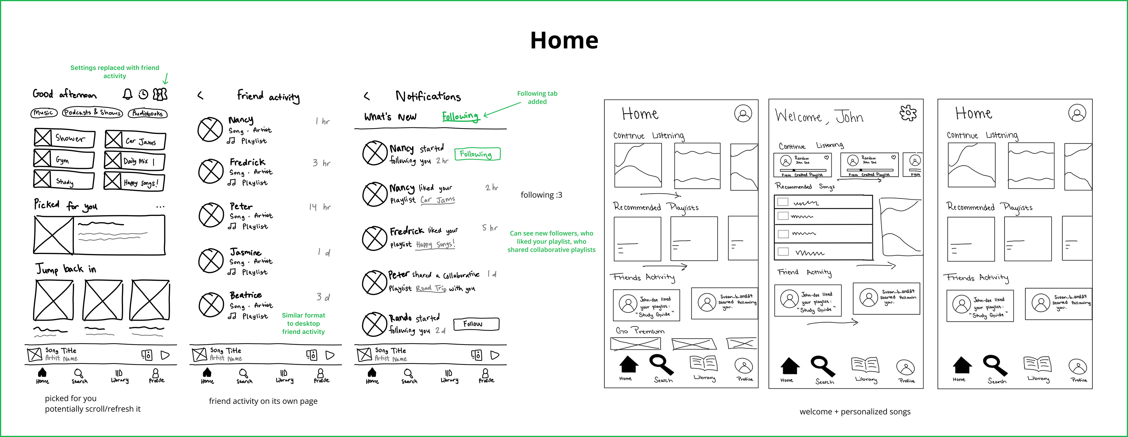
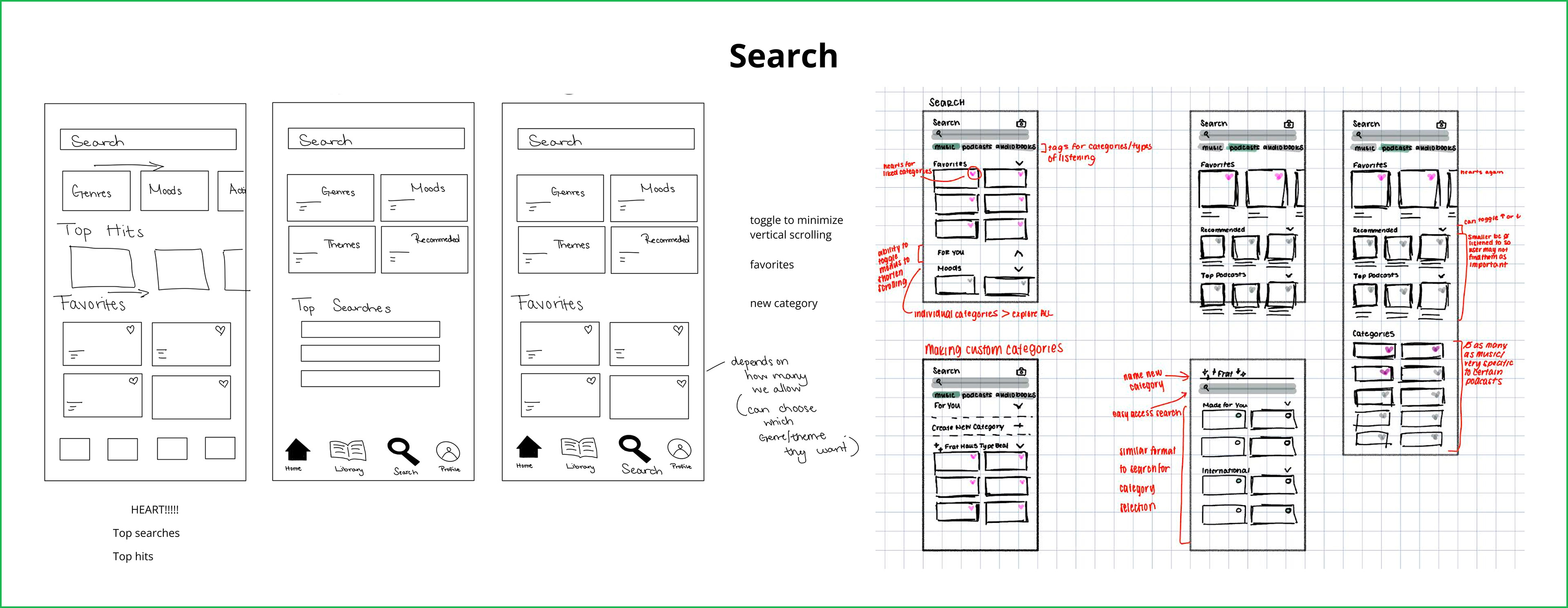
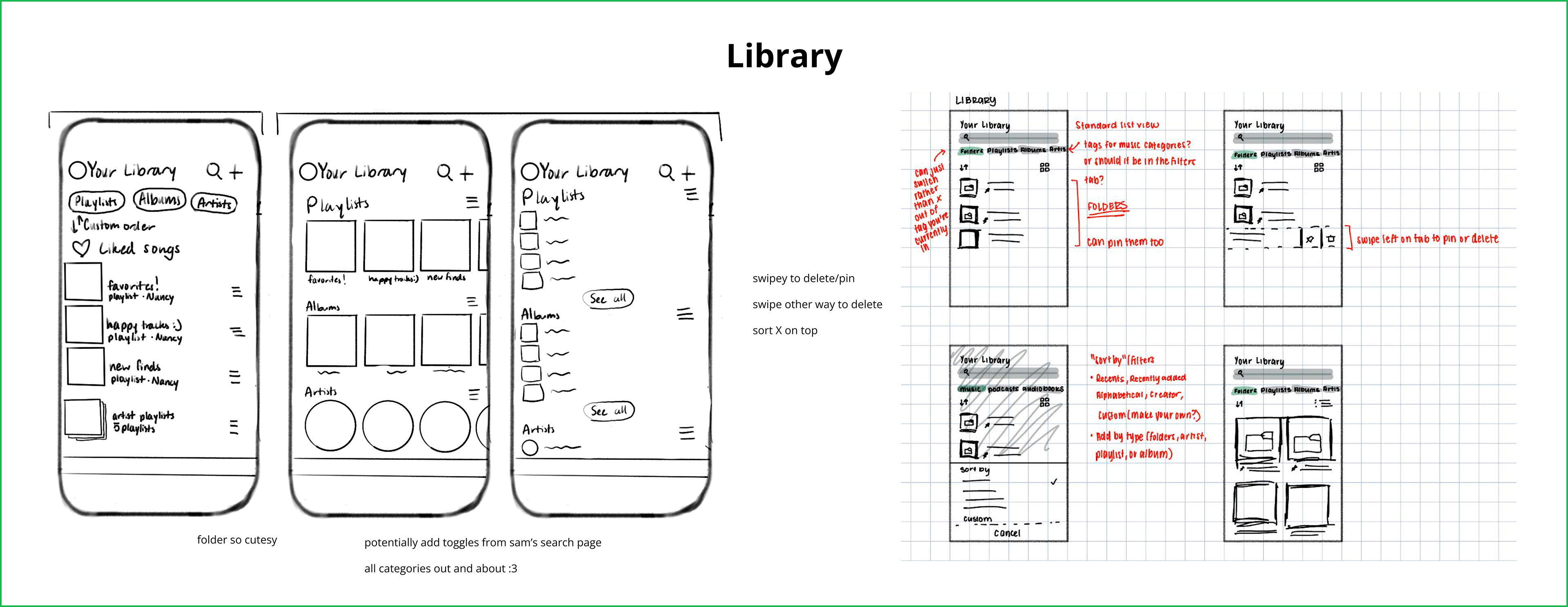
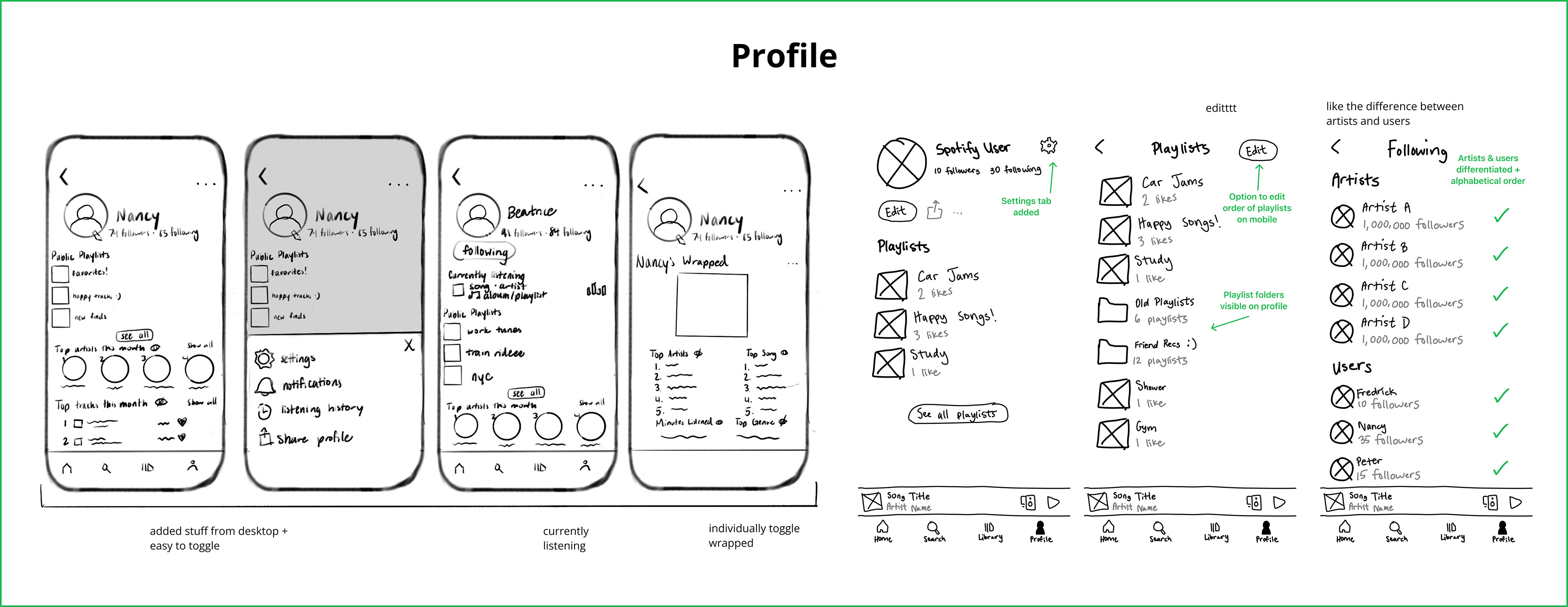
We started with rough sketches to communicate our initial ideas for the redesign. Each of us took two of Spotify's four main areas—home, search, library, and profile—and combined our ideas to determine which new features we should carry into mid-fis.
INFORMATION ARCHITECTURE
At this stage, it was time to make a big decision: a separate profile tab on the navigation bar. Based on input that users value social features and the profile is hidden from direct view, we believed this would be a beneficial change. We also made small changes such as adding a calendar, the friend activity page missing on mobile, and visible privacy toggles.
MID-FIDELITY WIREFRAMES
We each focused on a different part of Spotify's mobile experience, covering onboarding and the four navigation tabs. I was tasked with redesigning the home page, and our group periodically met to discuss the changes we made and ask for feedback. By the end of this process, we executed our own and our team members' ideas for improvement.
Onboarding
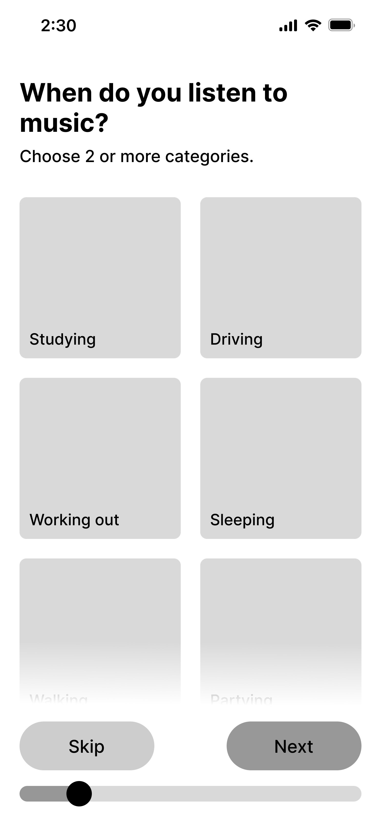
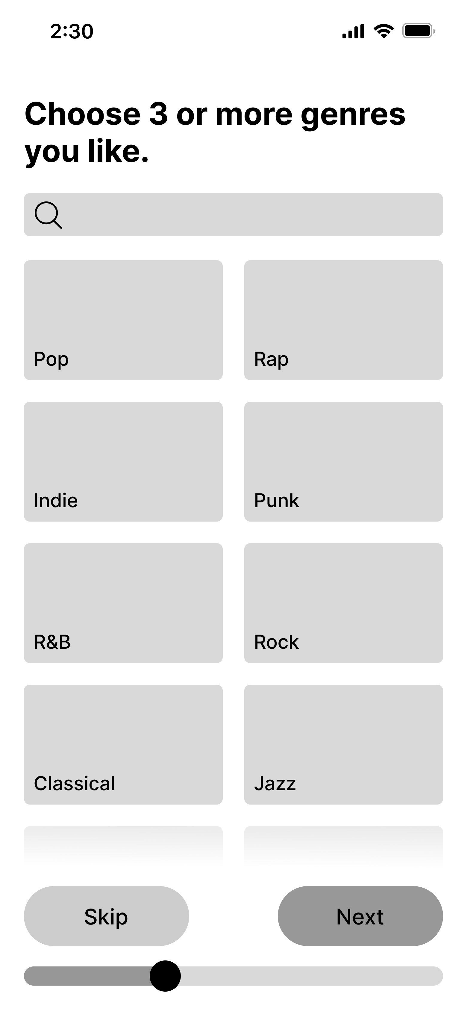
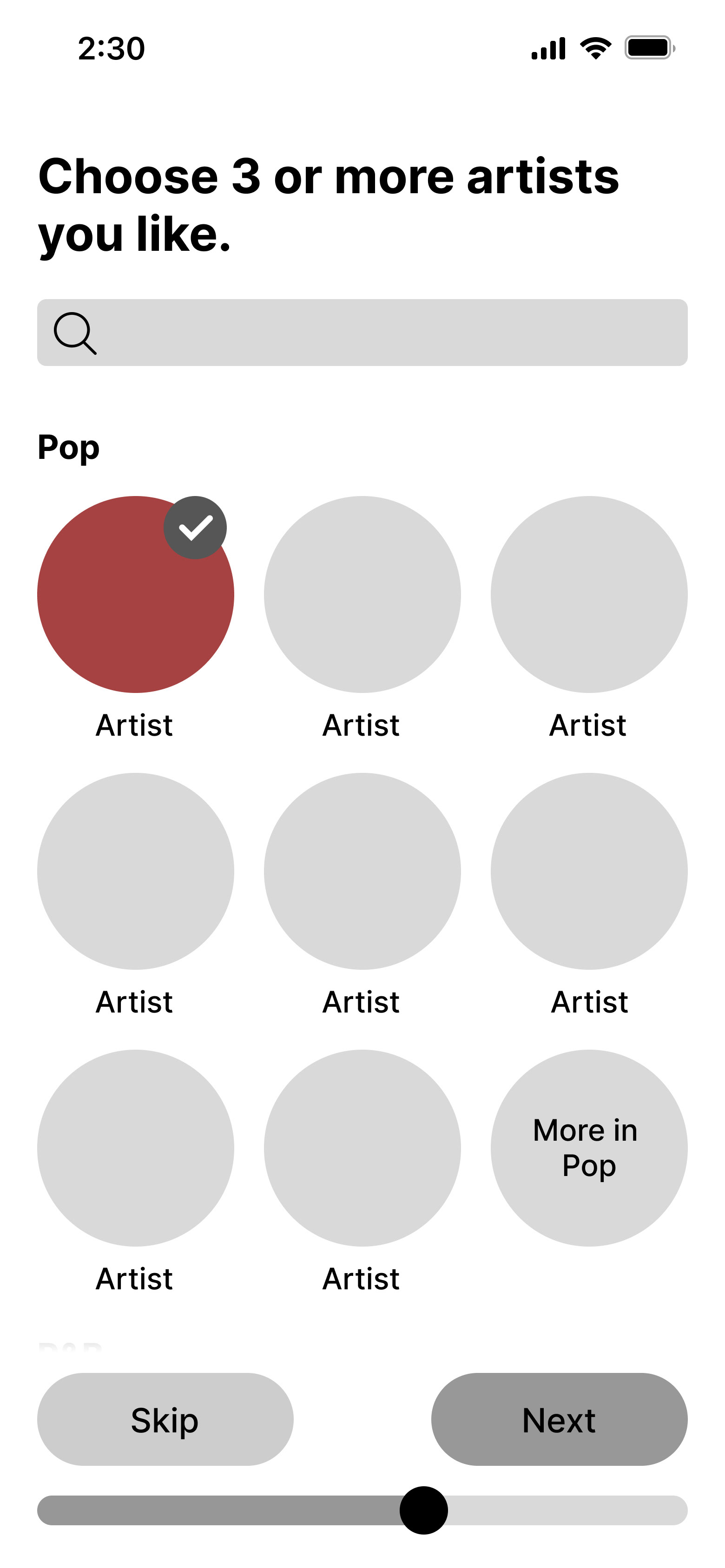
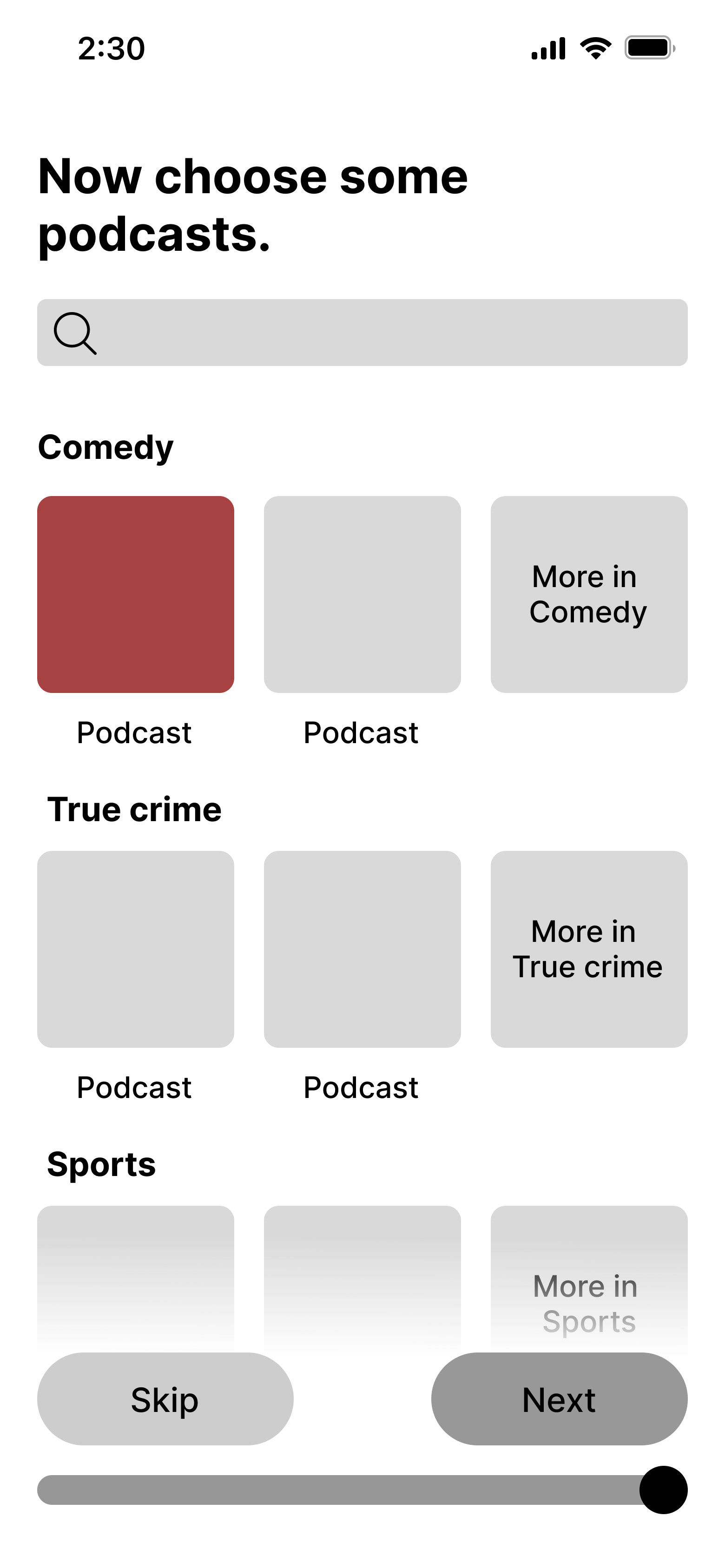
Additional questions designed to identify the content users want to see.
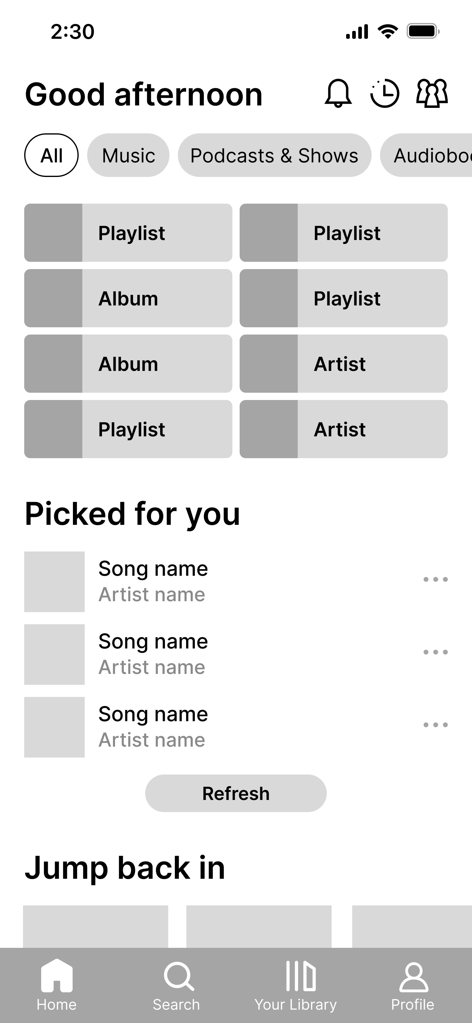
Home
More structure and addition of social features that make Spotify unique.
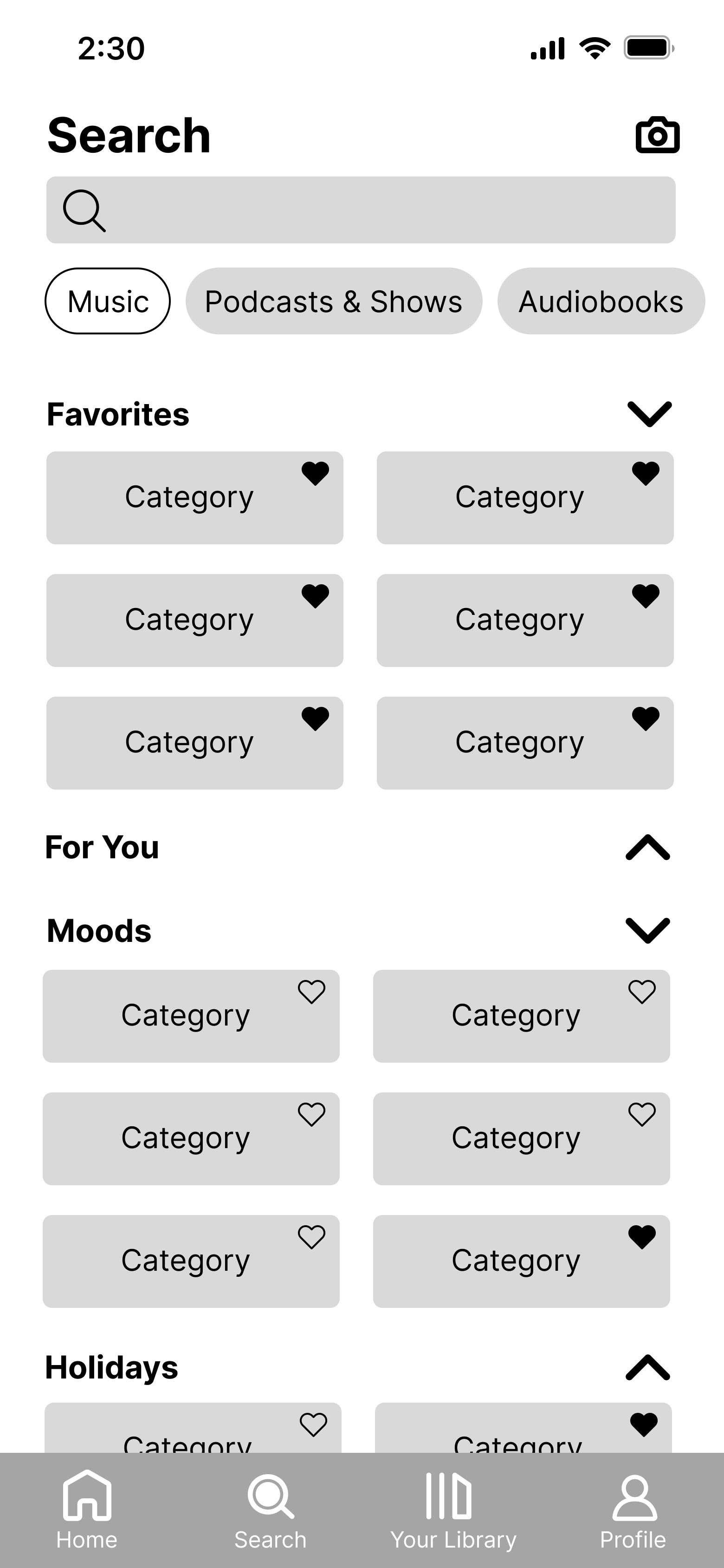
Search
Increased personalization and more order in the content displayed.
Library
Improved organization and integration of desktop's customization features.
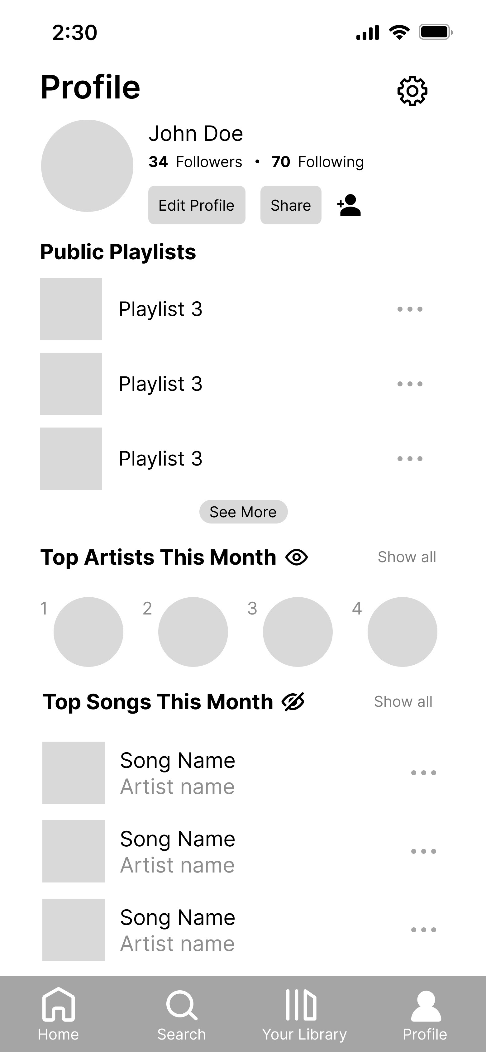
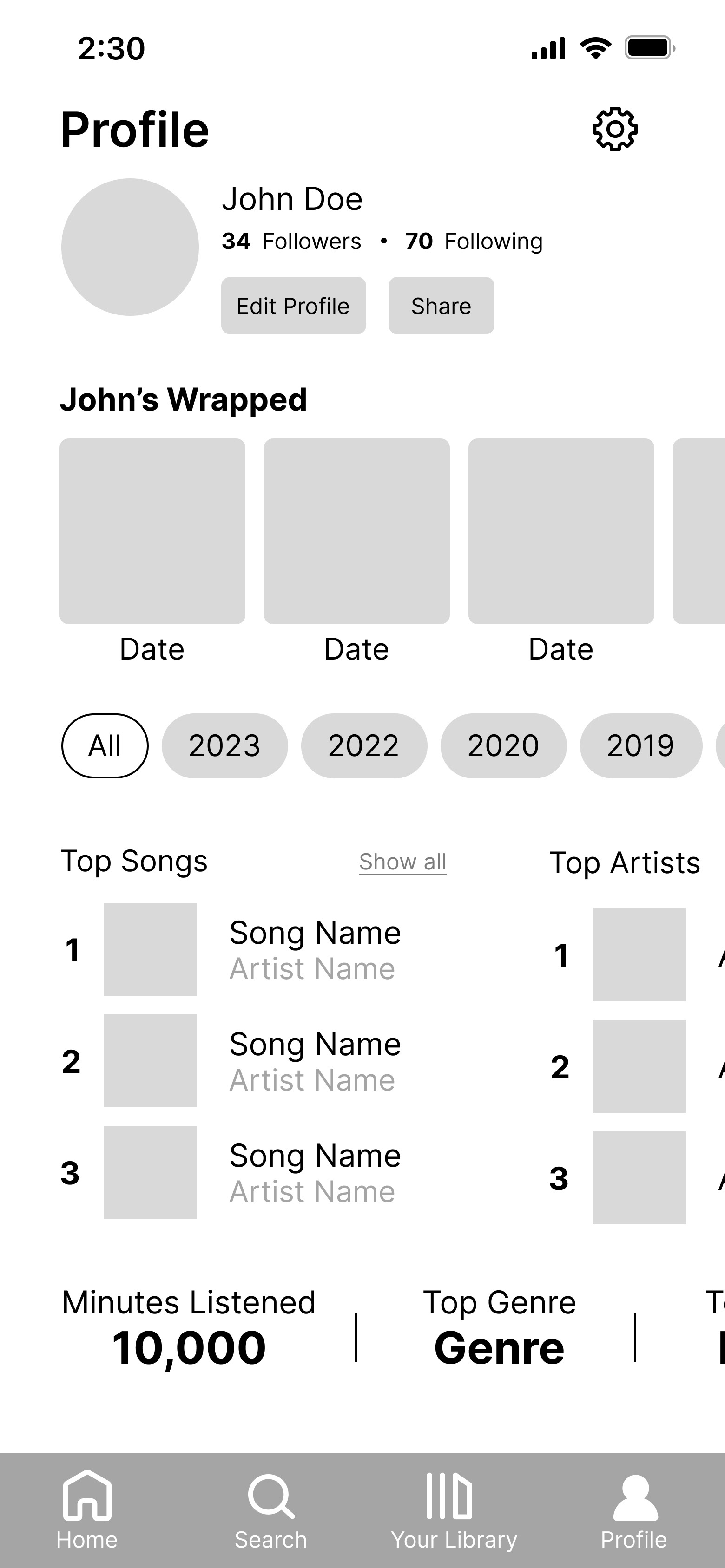
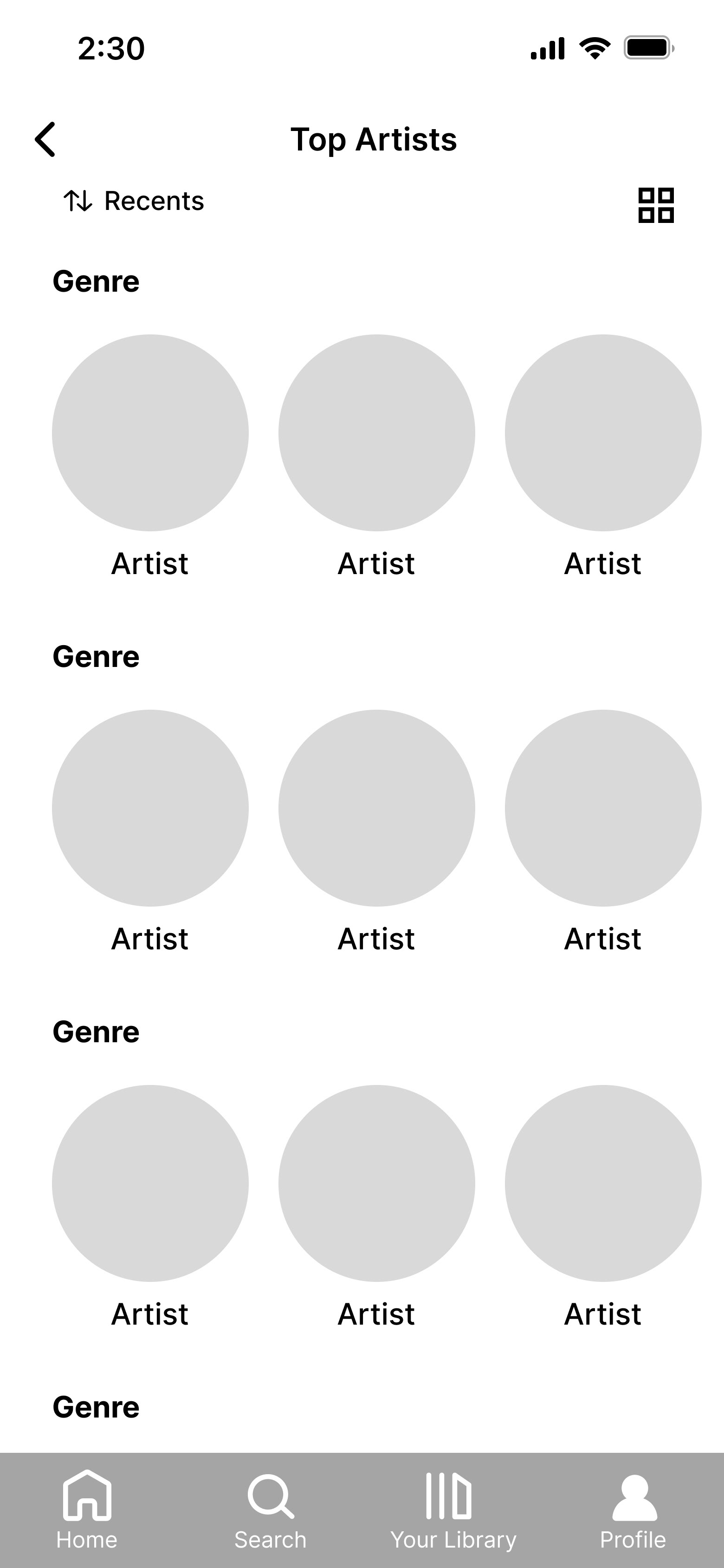
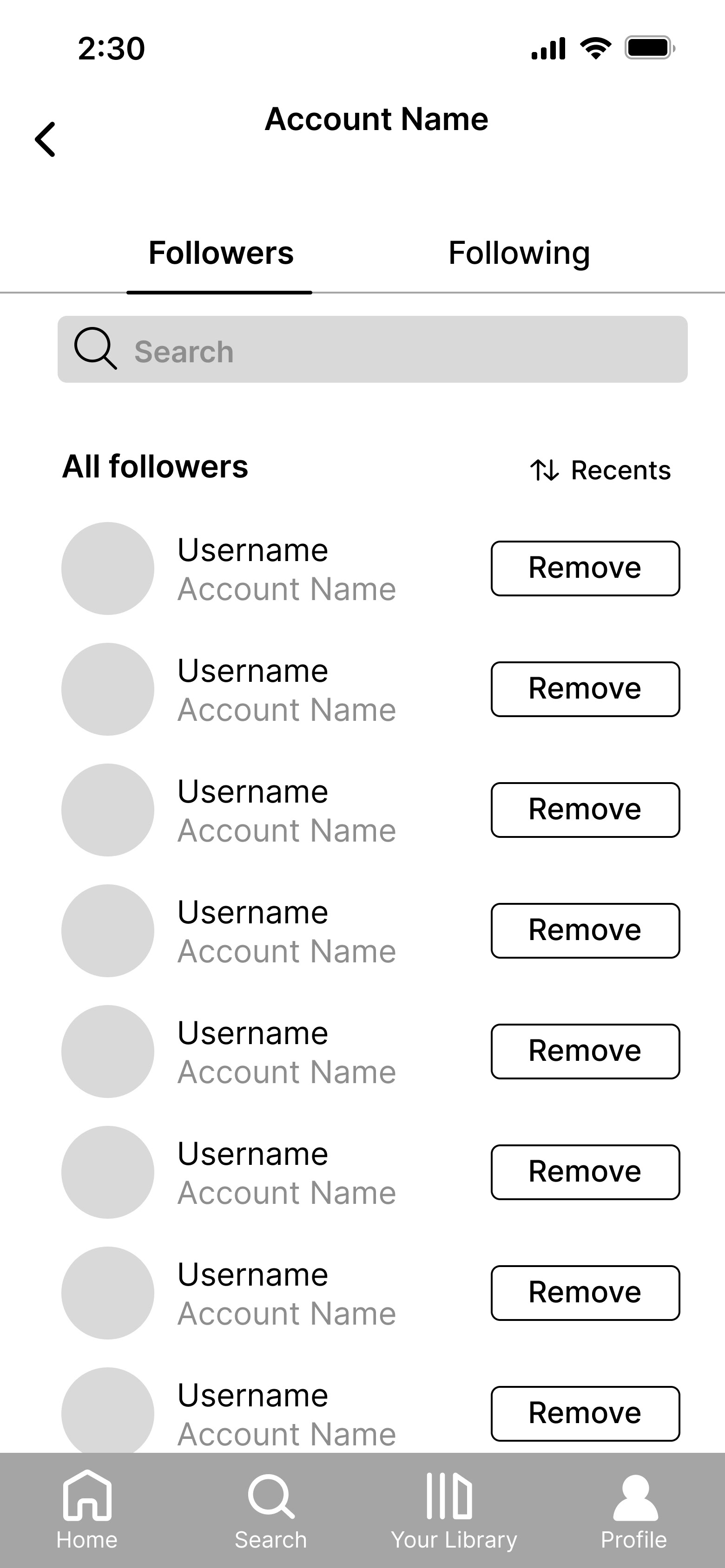
Profile
Options to see more information or easily make details private.
USER TESTING
Before we moved on to hi-fis, we wanted to get feedback on what was working and what wasn't so that we could make an improved final product. So, we prototyped a few key interactions and conducted 8 user tests. Here's what we found:
1. Users appreciated many of the new features we added.
People expressed that they liked the addition of friend activity and notifications, better organization in the library, heart icons used for favorited categories, and other features.
2. Some users had concerns about the amount of information on the profile.
It was a common sentiment that Spotify Wrapped being yearly is what makes it special and builds anticipation. People didn't want to see too much information from their Wrapped, though they appreciated seeing other statistics.
3. Some users had trouble touching small targets and text that was close together.
We took note of where users struggled and planned to remediate this in our final design.
05. Prototype
Without further ado, here's our final Spotify redesign with high-fidelity prototypes!
ONBOARDING
Genre Selections
In addition to choosing favorite artists, selecting favorite genres of music and podcasts will allow for more accurate recommendations.
When Do You Listen to Music?
Collecting information about when users listen to music will allow Spotify to recommend helpful playlists for sleeping, studying, etc.
Progress Bar
Users can see their progress during onboarding. Once they've chosen music, they can choose podcasts or click "done". Opting to select podcasts will slightly push them back in the progress bar to reflect this.
Skip Button
If users feel that onboarding is slow or unnecessary, they can skip any part. If they aren't interested in podcasts, the podcasts section can be skipped altogether.
HOME
Picked For You
Spotify will recommend three songs that can be refreshed. This is placed after recent playlists since we found that users gravitate toward them.
Revamped Podcast View
Instead of one podcast's most recent episode filling the entire screen, users can see multiple podcasts with a description of the overall podcast. The ability to play the most recent episode is maintained.
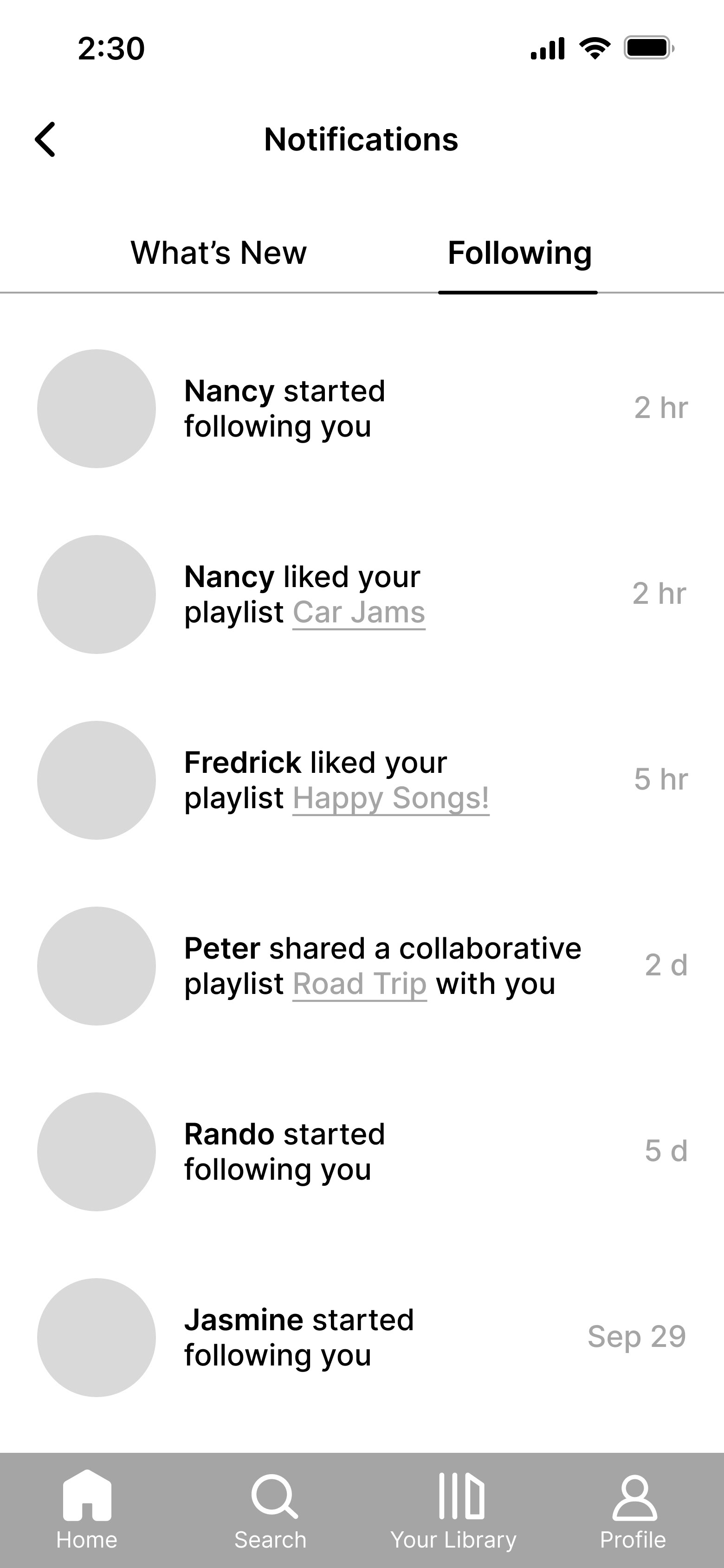
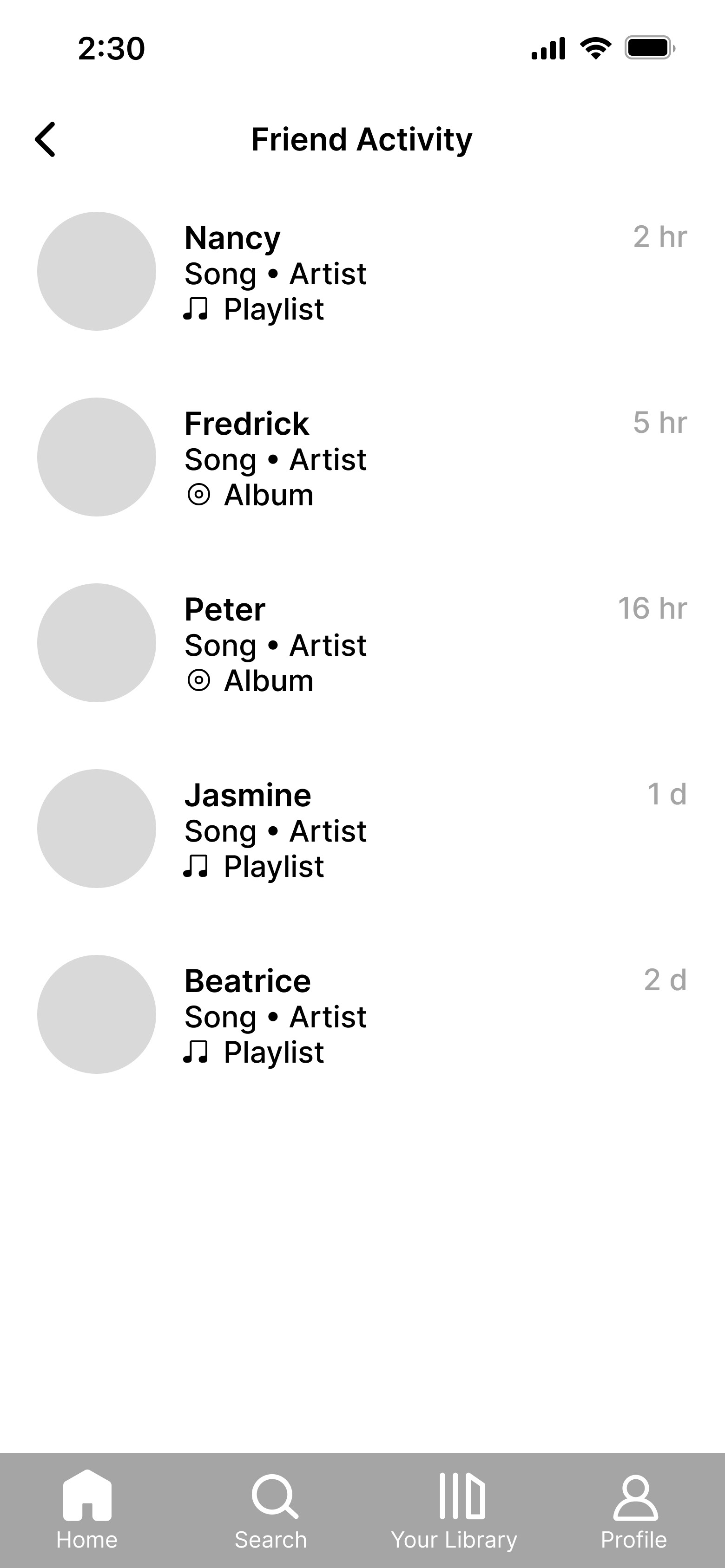
Following & Friend Activity
We added a following tab where users can see notifications such as new followers, likes on their playlists, and collaborative playlist invitations. A friend activity tab was also created for users to see what their friends are listening to, formatted consistently with the desktop version.
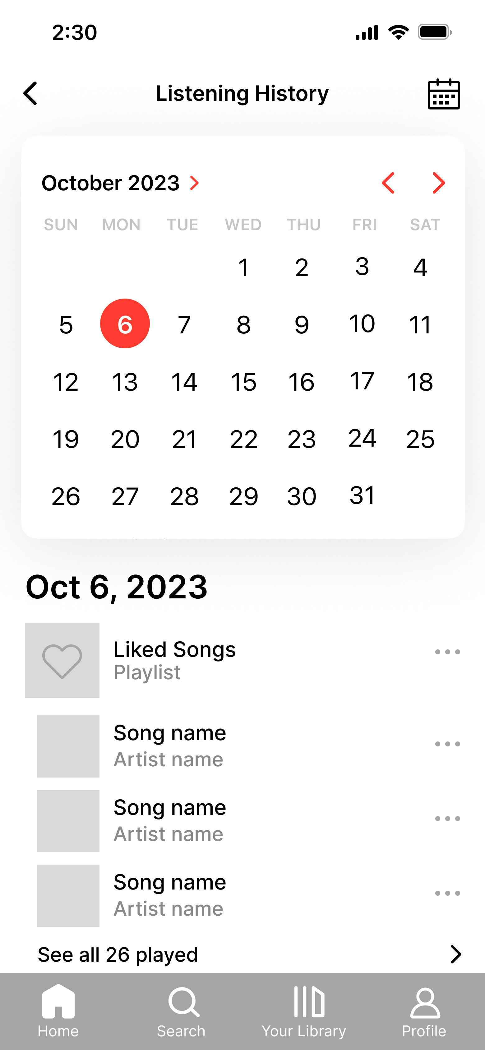
Reorganized Listening History
To reduce vertical scrolling, listening history is condensed to three songs per day and a "see all" option. We also implemented a calendar for users to easily jump to a specific date instead of spending time searching.
SEARCH
Category Toggles
Instead of displaying all genres with no organization, genres are categorized and can be expanded and minimized. This lets users hide categories they're uninterested in and spend less time scrolling.
Favorites Category
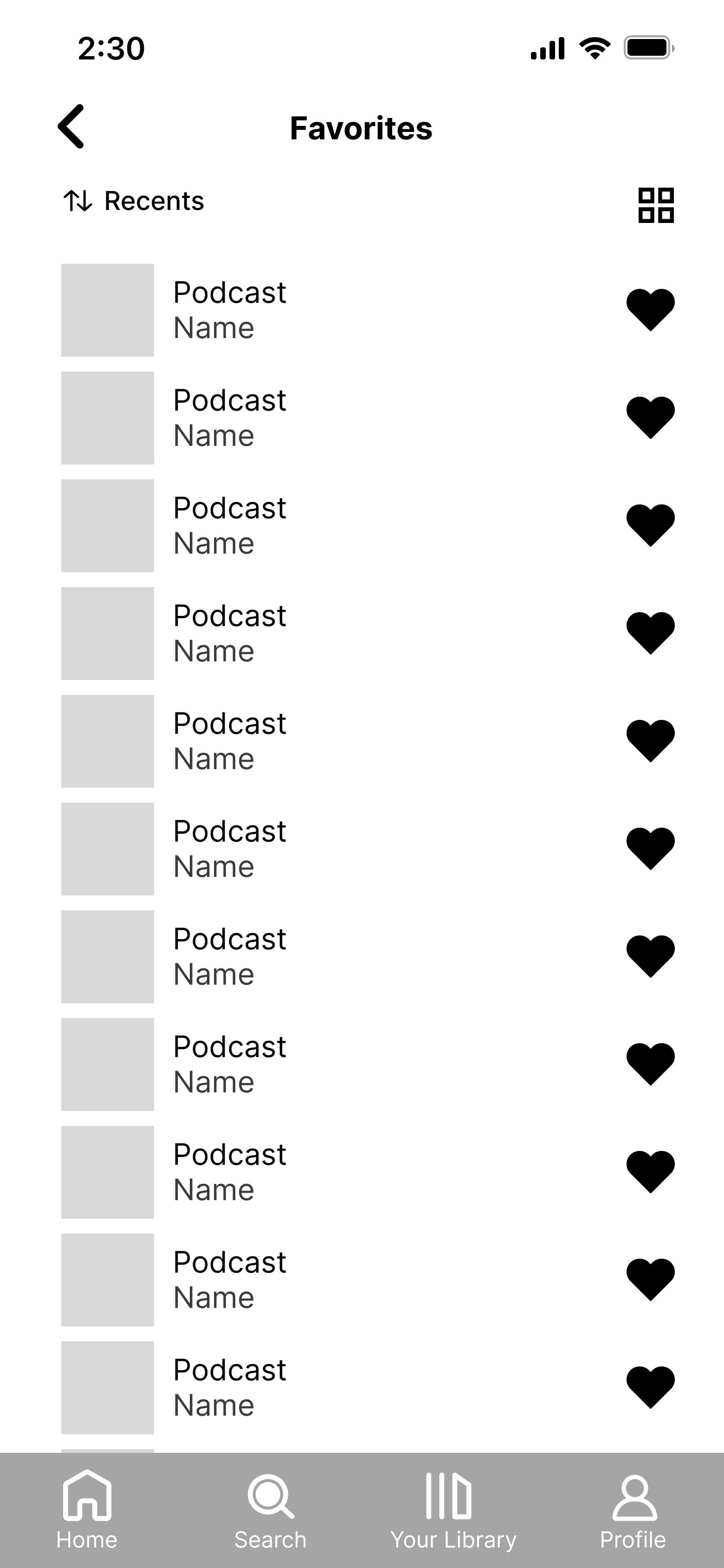
A pinned favorites category was implemented for users to easily access their favorite genres. This allows users to personalize the search page.
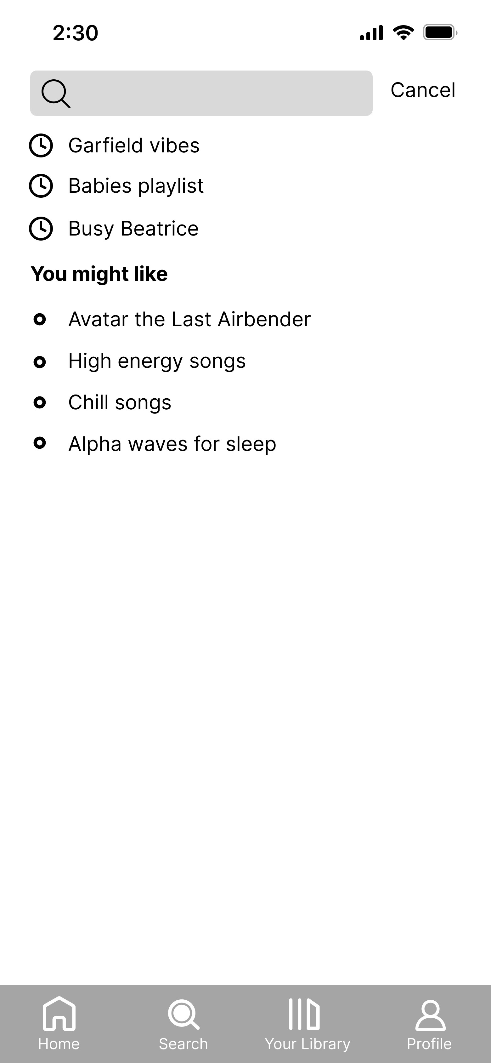
You Might Like
Below the recent searches section, Spotify will recommend searches based on users' search and listening history.
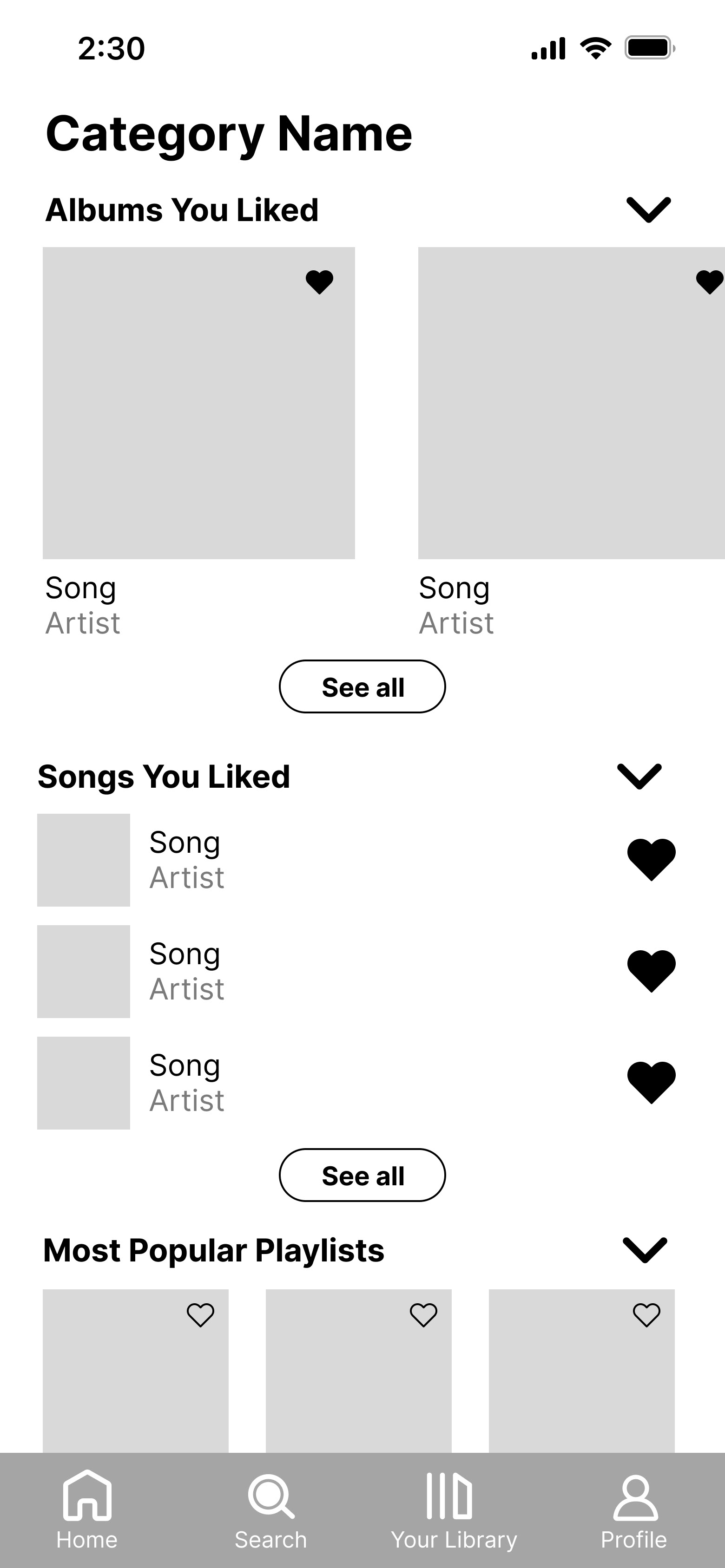
Albums/Songs You Liked
Once a genre is clicked, users can see albums and songs they've liked in that genre. Since we found that users typically go to their own music over recommendations, we placed them above recommendations.
LIBRARY
Improved Organization
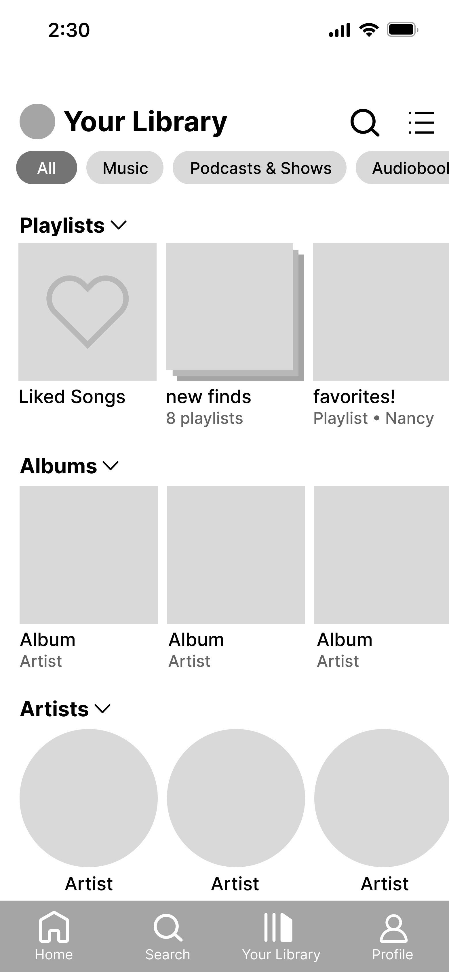
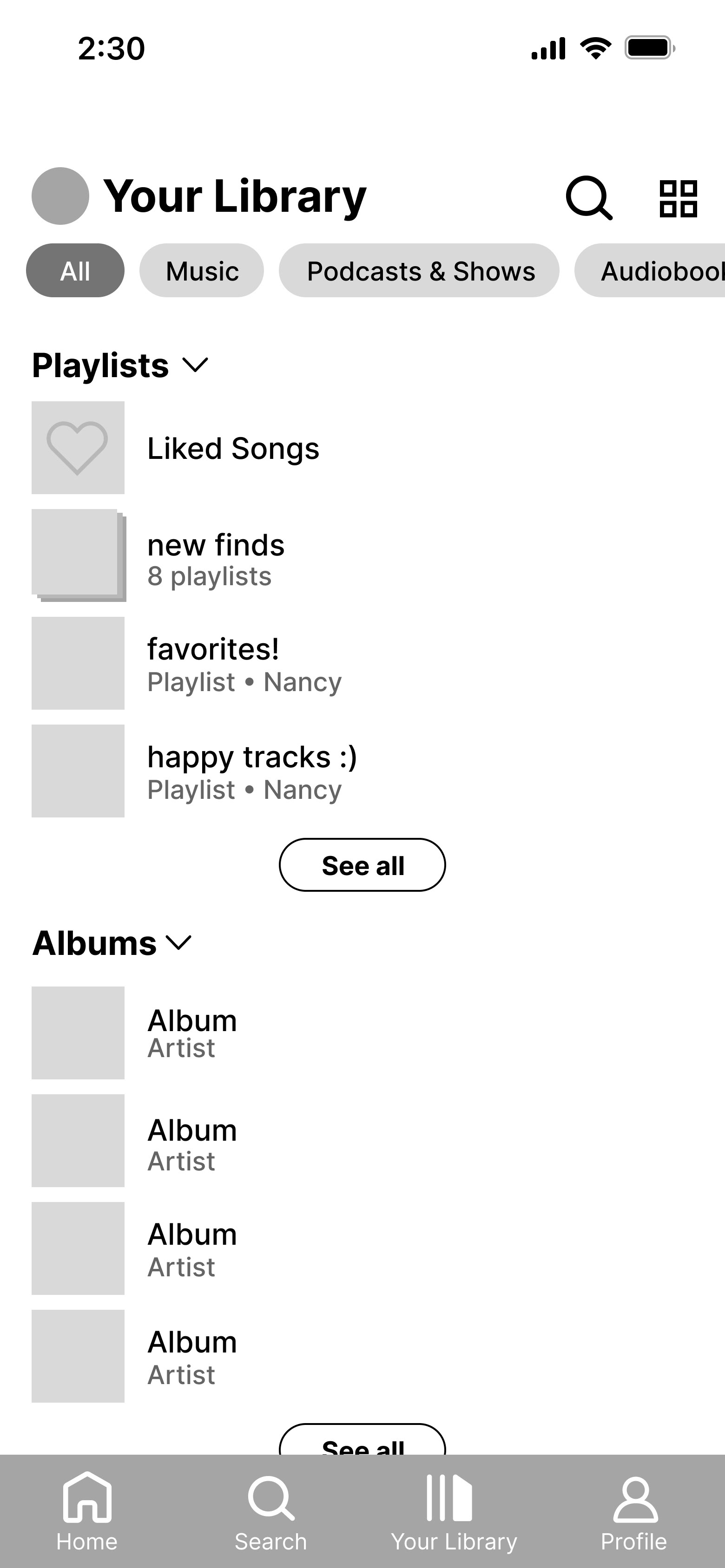
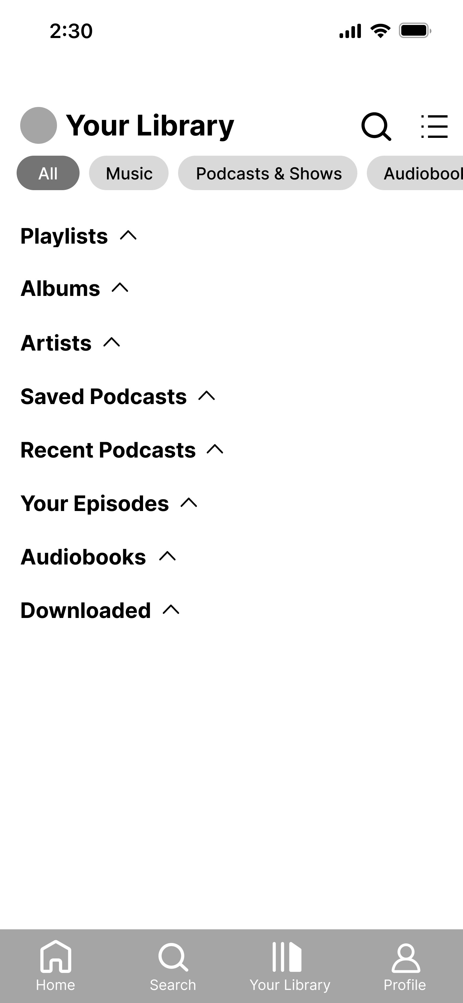
Instead of cluttering all content types together and having to filter them, the library is sorted by default. The top four playlists/albums/artists are shown with a "see all" option, allowing ease in navigating a large library.
Compact View
To maintain consistency with the desktop version, we added a compact view where only the titles are shown with no accompanying visuals.
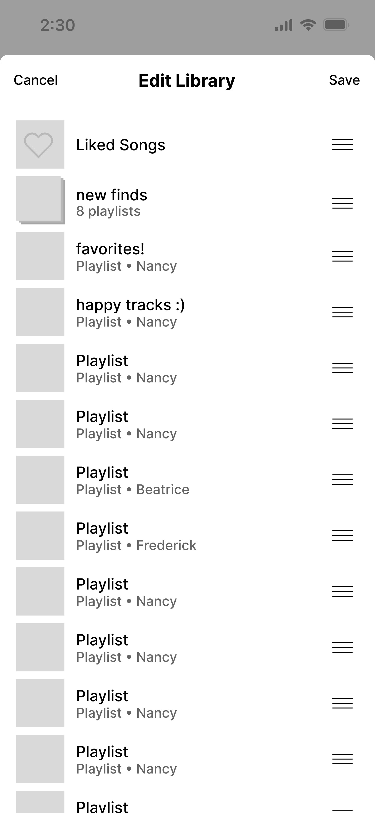
Reordering Content
We added an edit menu to reorder content in the library, yet another feature missing on the Spotify mobile version. Users can easily personalize their library and push favorites to the top.
New Folder Covers
Based on input that users would like to customize the default manila folder covers, users can select images to be folder covers. They have an added layer effect to visually differentiate them from playlist covers.
PROFILE
Top Songs & Artists
Similar to the desktop version, users can display top songs and artists on their profiles. This gives users easy access to their current favorites.
Wrapped Playlists
Since Spotify Wrapped is a widely appreciated feature, users can display Wrapped playlists from previous years on their profiles. However, other statistics aren't shown to maintain novelty and excitement.
Privacy Toggles
If users wish to hide their top songs/artists or their Wrapped playlists, they may easily switch them off directly from the profile. Compared to going to the settings page, this has higher visibility and fewer steps.
New Following Features
We added a search option to the followers & following tabs to minimize time searching large lists. In addition, when users go to their friends' profiles, they may see what they're listening to if the feature is enabled.
06. Reflection
TAKEAWAYS
This was my first time working on a redesign project with a team, and I greatly enjoyed it! I got to work with some talented designers, and the feedback and guidance from my team members helped me grow as a designer and create a collaborative, cohesive product. I also gained experience presenting my work and using research to explain my design decisions to the supportive community of Design Innovation Illinois. Though it was intimidating, the kind comments my team received made me feel proud of the work we accomplished.
I'm also an avid user of Spotify, and completing this project made me think about the app—faults and all—from an entirely new perspective. I learned what it meant to design with the overall user base's needs in mind and not simply base my decisions on what I want to see in the app. When I was stuck, consulting my team always provided me with new ideas and approaches to improving Spotify's user experience.
NEXT STEPS
As this project had a limited time scope, we didn't get a chance to conduct a second round of user testing. If we had more time, our next step would be to get further feedback on our hi-fis and evaluate which decisions were useful and which ones need to be improved. Then, we would iterate once again to make a refined final product.
