Role: UX Designer
Timeline: 3 weeks (July – August 2023)
Tools: Figma
01. Overview
The Problem
Young adults have a lot on their plates—figuratively. With limited time and money to spare, they look for quick and easy meals they can prepare in between college classes or after a long day at work. The issue arises in many recipes requiring too much effort or too many supplies they don't currently have. Thus, the infamous coffee and ramen diet is born.
The Solution
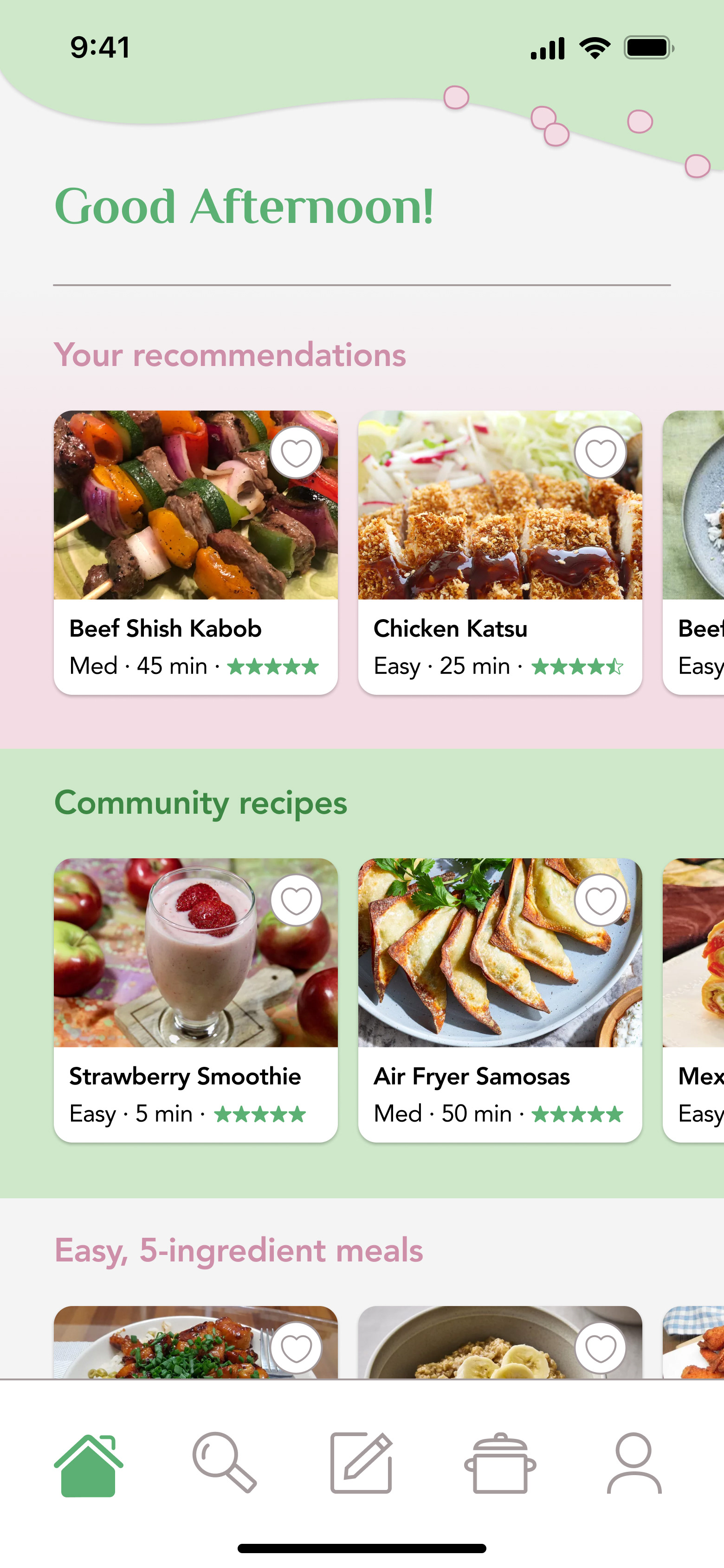
MiniMeals is a mobile app designed to provide young adults with easy, quick, and affordable recipes. Users can select the ingredients and kitchen equipment they wish to work with, save and import recipes into a meal planner, and view local recipes trending in their area. Users are able to submit their own recipes to be reviewed as well.
02. Understand
USER SURVEY
To better understand my target users, I surveyed 13 people aged 18-24 about their meal preparation habits and frustrations. Questions included asking how cost and effort factor into their meal preparation, how they find new recipes, and how often they vary their meals. Here were some key takeaways:
84.6% of respondents said a lack of time prevents them from getting ingredients and preparing more meals themselves.
61.5% of respondents strongly agreed that they won't make a recipe if it has many ingredients they don't currently own.
38.5% of respondents said it's hard to find recipes that fit their dietary needs and preferences.
Only 23.1% of respondents said they often try new recipes and vary their meals, while 84.6% said they'd like to vary meals more often.
AFFINITY MAPPING
When asked about their struggles in finding recipes and making/planning meals, there were some key responses that I wanted my design concept to take into consideration. So, I used affinity mapping to highlight standout quotes and categorize the problems that target users expressed.
COMPETITIVE ANALYSIS
Next, I took a look at three of the most popular mobile apps for recipe finding and meal planning: Tasty, Yummly, and Food Network. Through analyzing each of their strengths and weaknesses along with their unique approaches to delivering recipes, I gained insight into where each app shined and fell short.
03. Synthesize
DEFINING INSIGHTS
Now that I had a better understanding of my target users' needs and pain points, I narrowed my findings down to three key insights that I would keep in mind throughout my design process:
1. Young adults want easy, low-effort recipes that don't require too much time.
2. Lack of ingredients and supplies is a common struggle that young adults face in meal prepping.
3. While many young adults don't regularly vary meals, they want to try new recipes more often.
HOW MINIMEALS CAN STAND OUT
Most popular recipe apps appear to be geared toward people who are confident in their cooking skills and know what they're doing. To someone who isn't as familiar, being bombarded with difficult recipes and facing indecision due to choice overload may be discouraging. MiniMeals can aim to provide a simple, streamlined way to find new recipes and see what other people in the community are creating as well.
USER PERSONA
Using the insights gained from my preliminary research, I built a user persona that reflected the goals and frustrations of my target users. This would guide the rest of my design process as I kept the people I was designing for in mind.
04. Ideate
USER FLOW
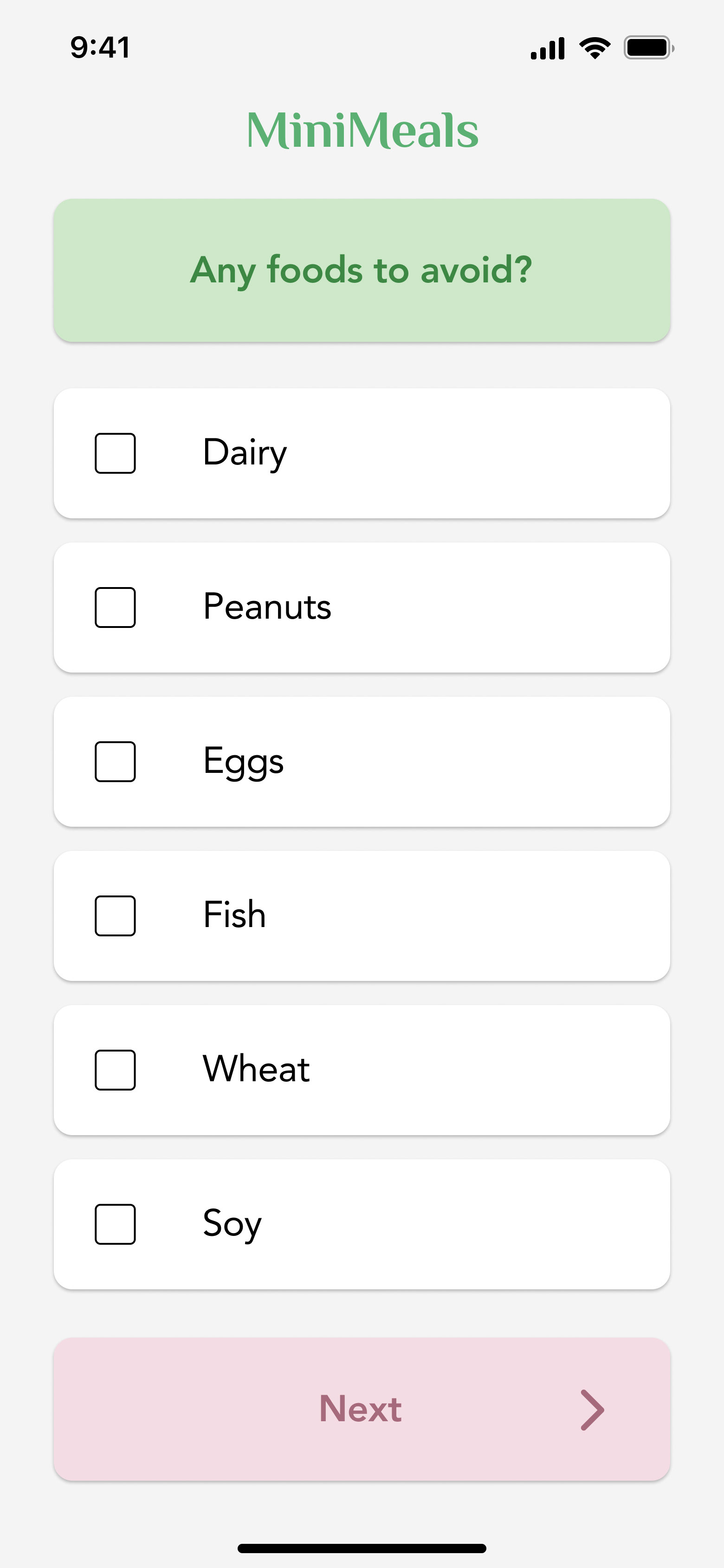
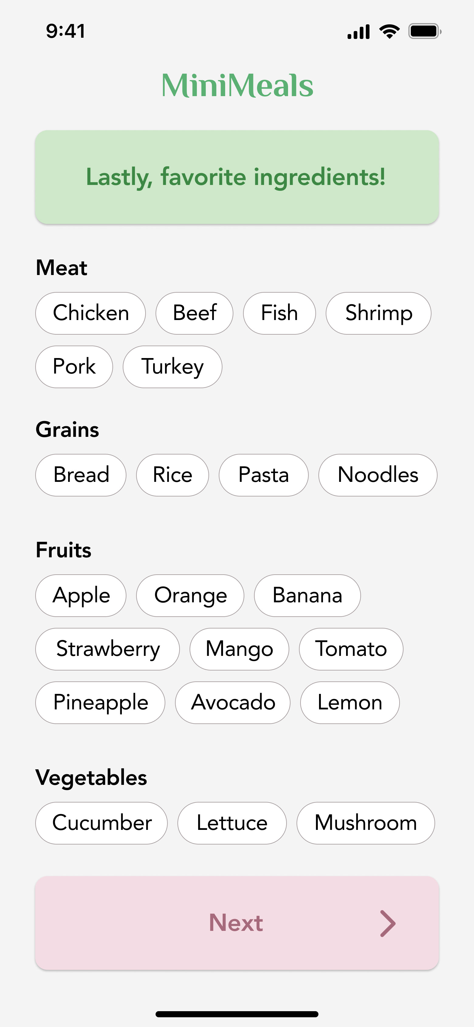
There were some key features that I felt were necessary to implement, including an onboarding flow that sets dietary preferences and an option to search for recipes with specific ingredients, equipment, difficulty, and time constraints. Based on input that my target users would also like to share recipes and have the app act as a local cookbook, I also planned to add a submission form for users to suggest their own recipes.
Other features I included were options to add personal recipes, import online recipes, and add notes to saved recipes in the meal planner. On the profile tab, users can also see their own and others' saved recipes and reviews.
LOW-FIDELITY SKETCHES
As a starting point, I sketched what screens could look like and how the flow of interactions would be implemented. This included the onboarding questions and the main screens for each of the navigation tabs—home, search, add a recipe, meal planner, and profile.
05. Prototype
HIGH-FIDELITY WIREFRAMES
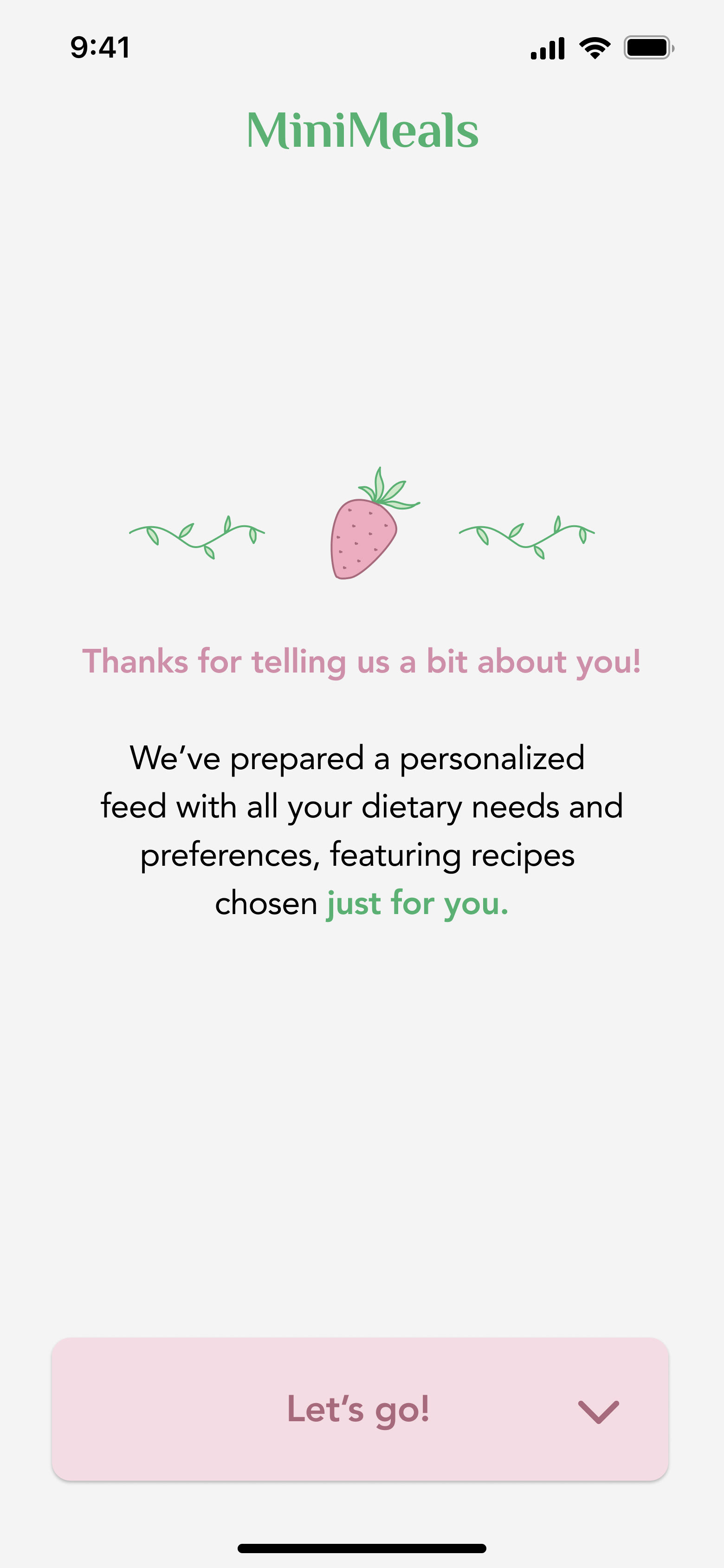
At long last, here are my final hi-fi designs!
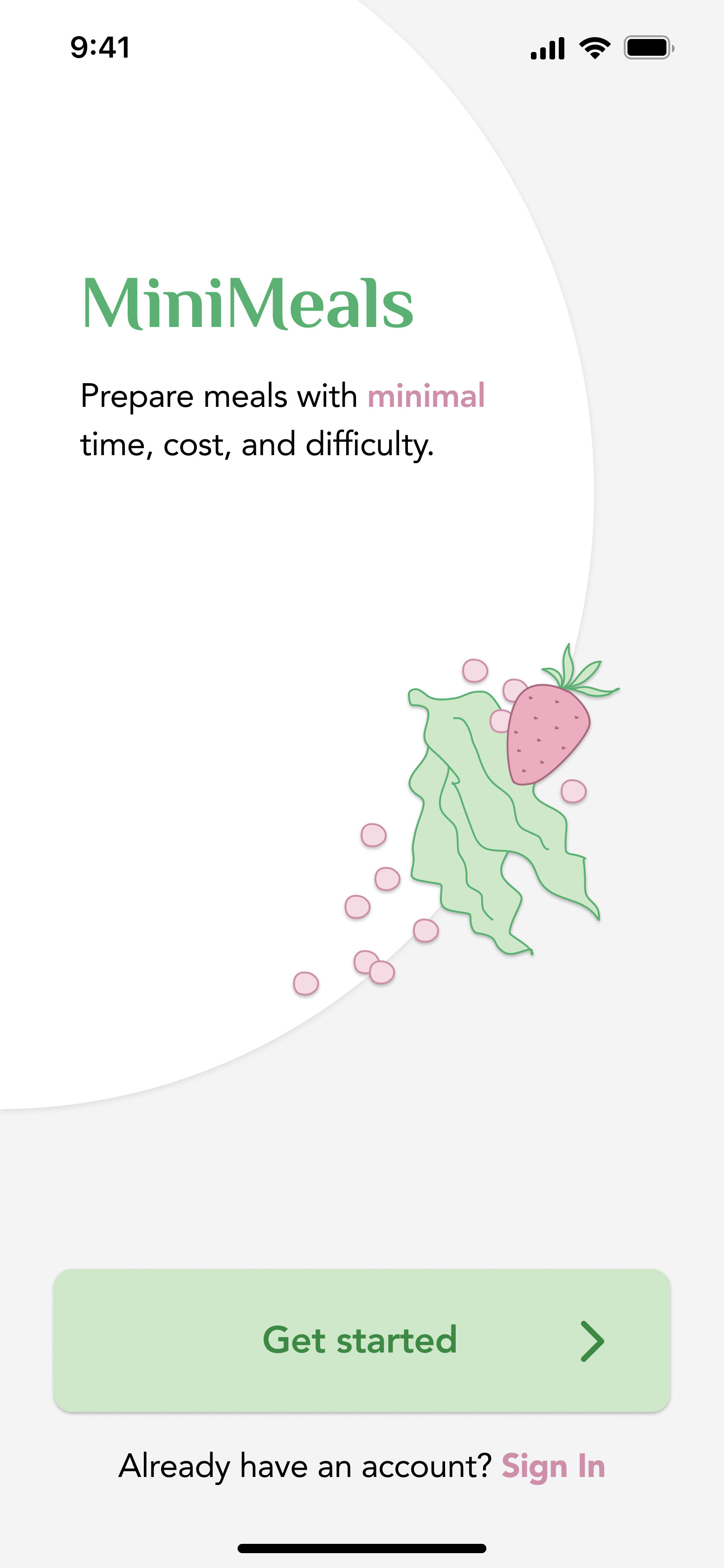
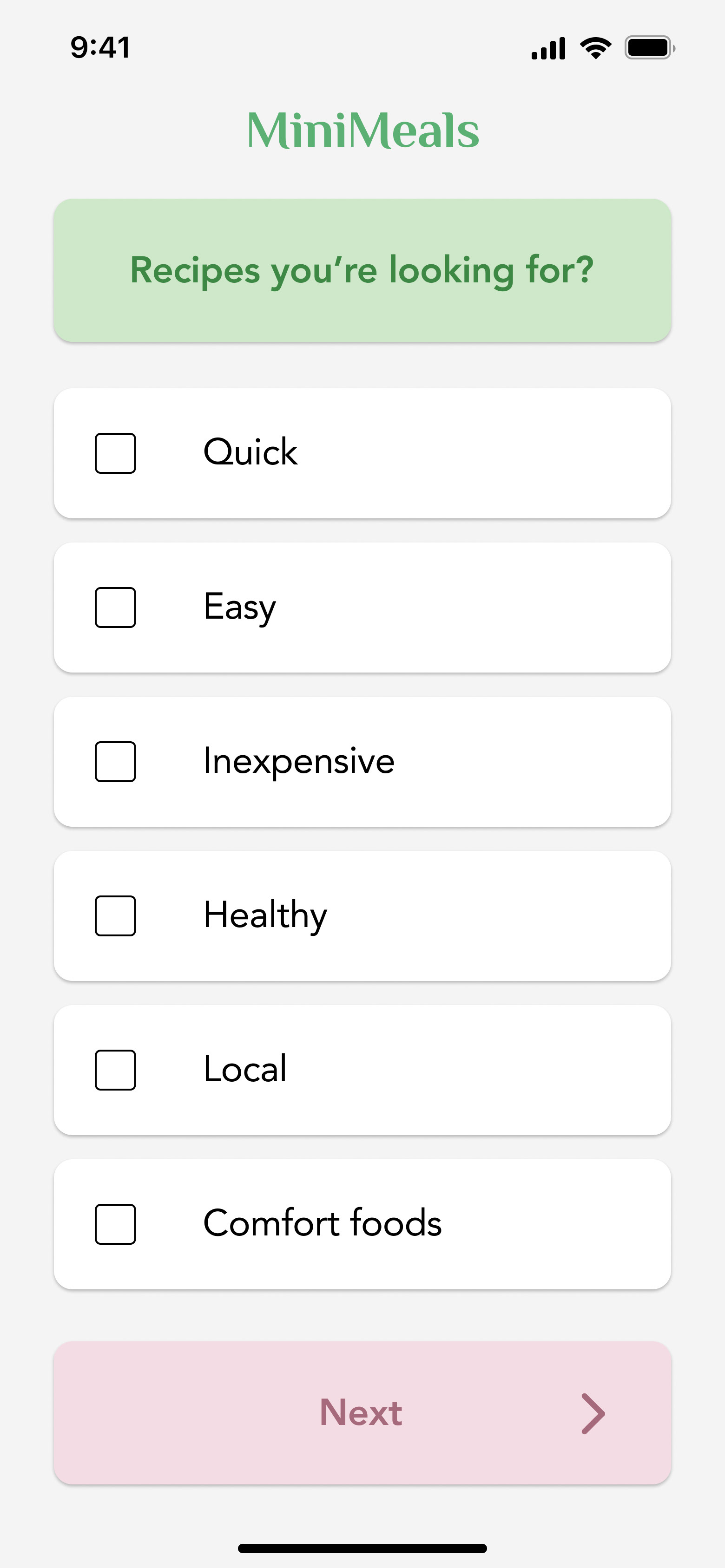
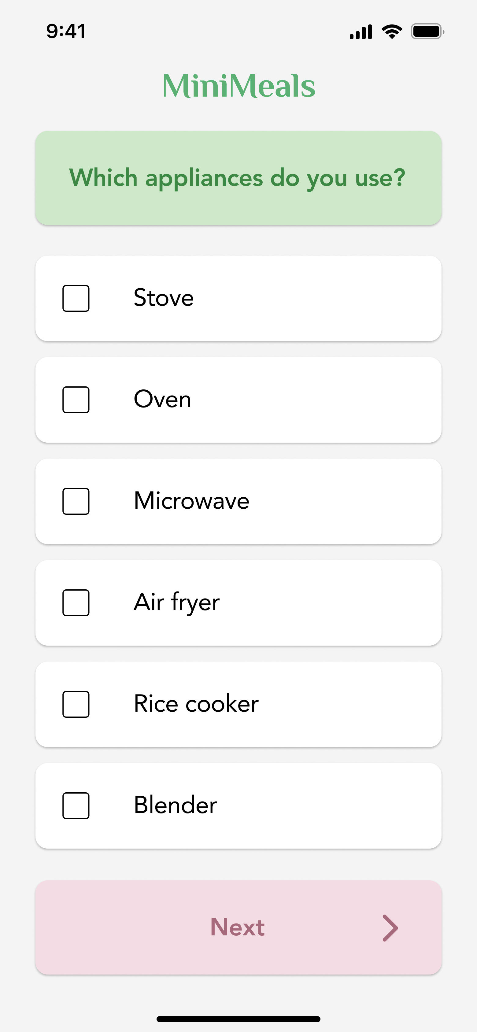
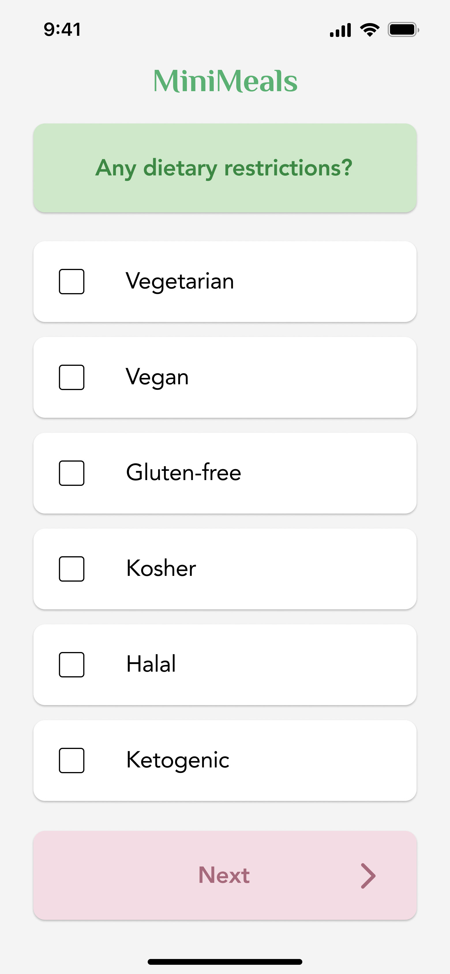
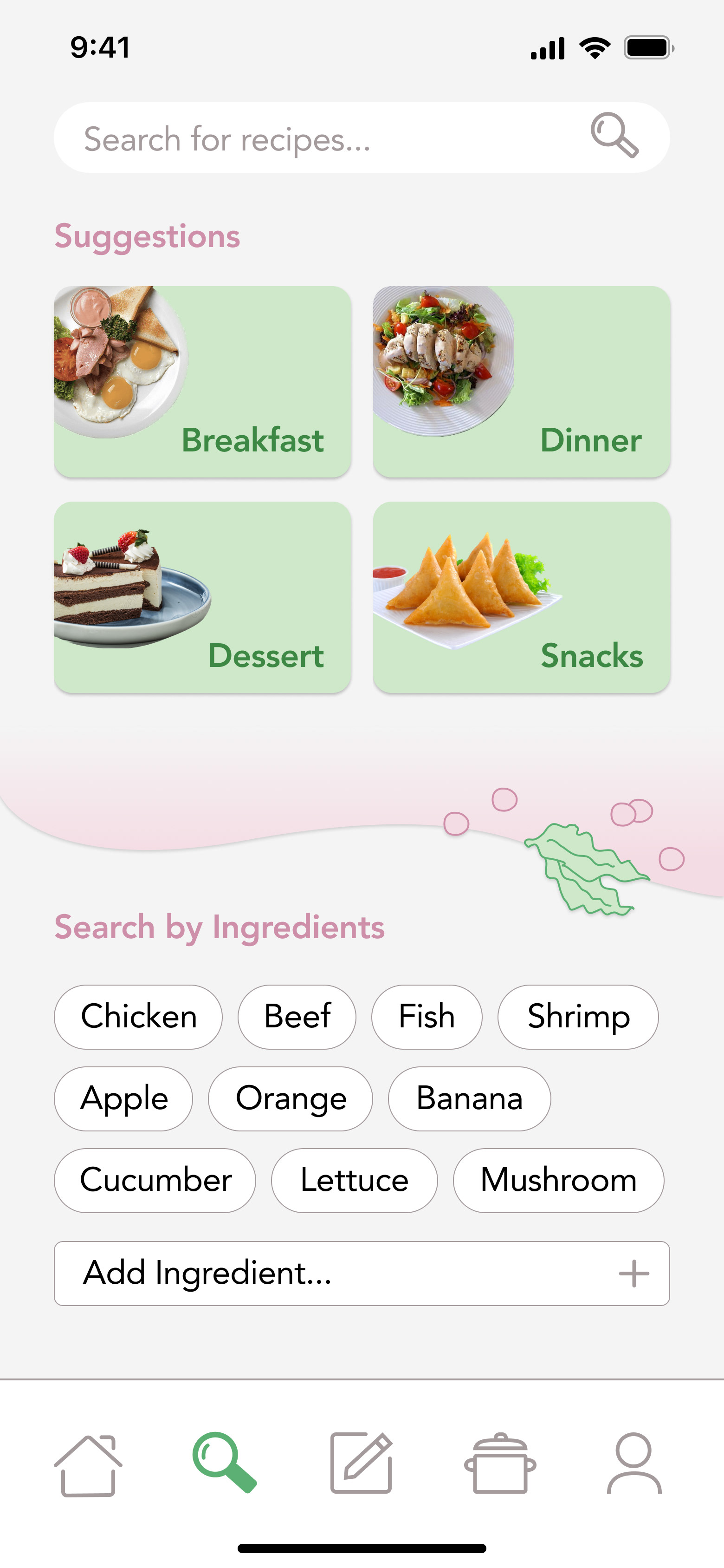
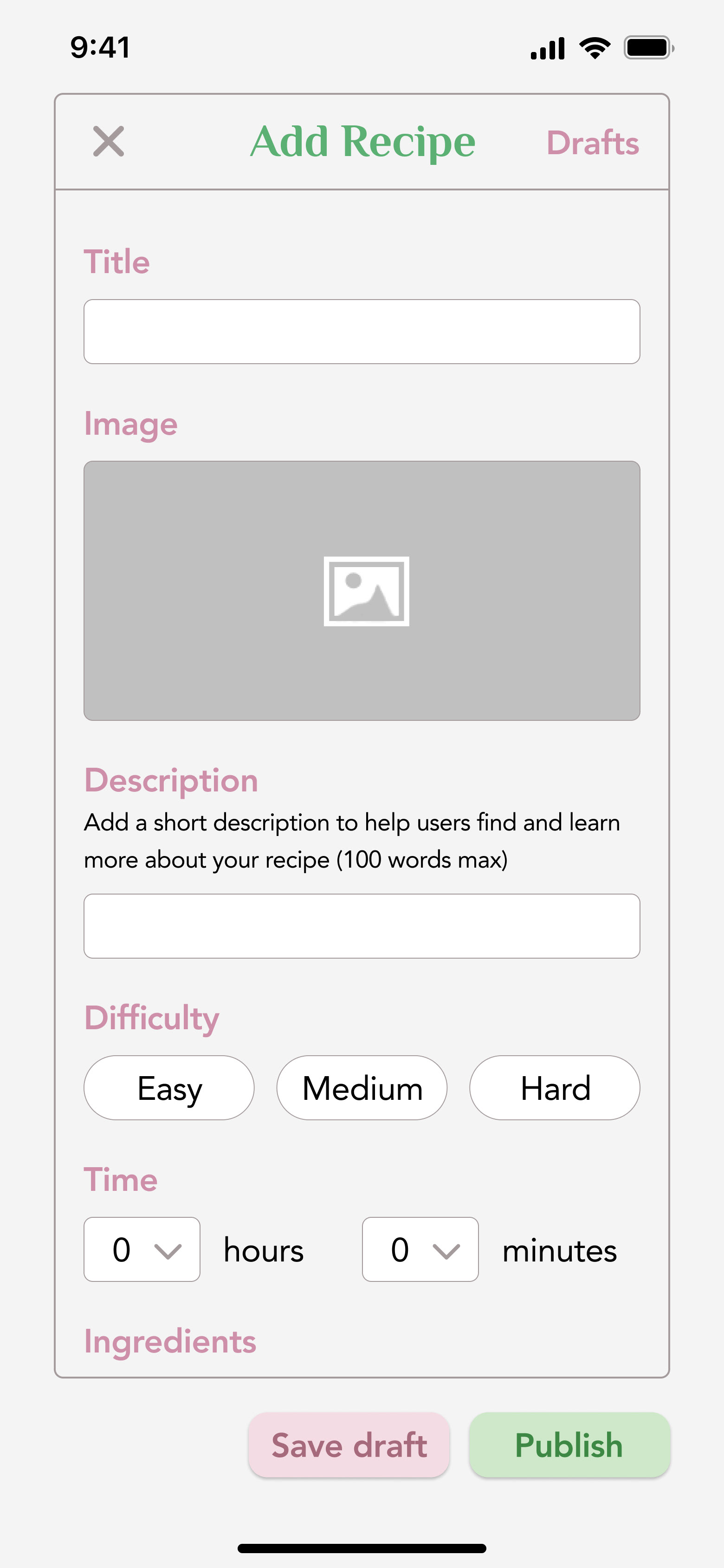
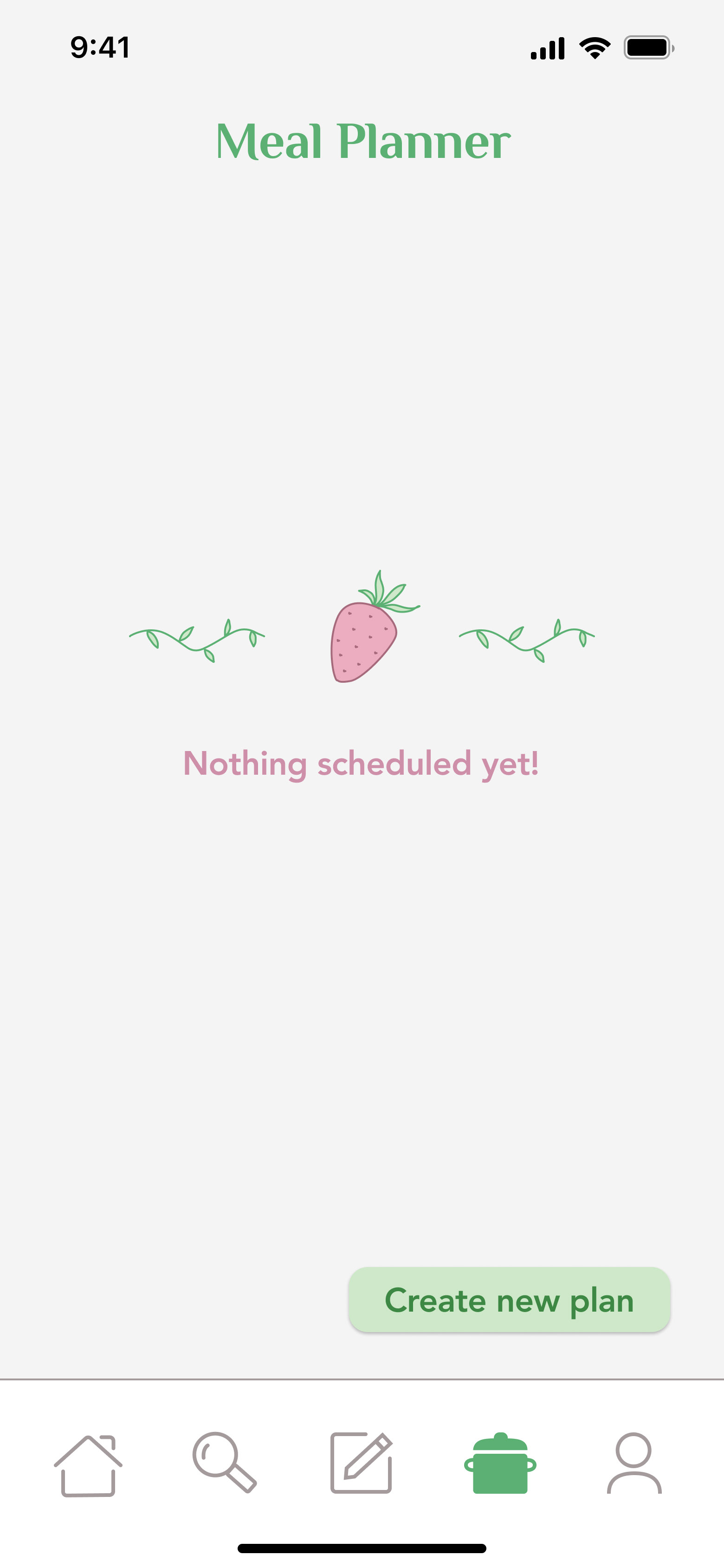
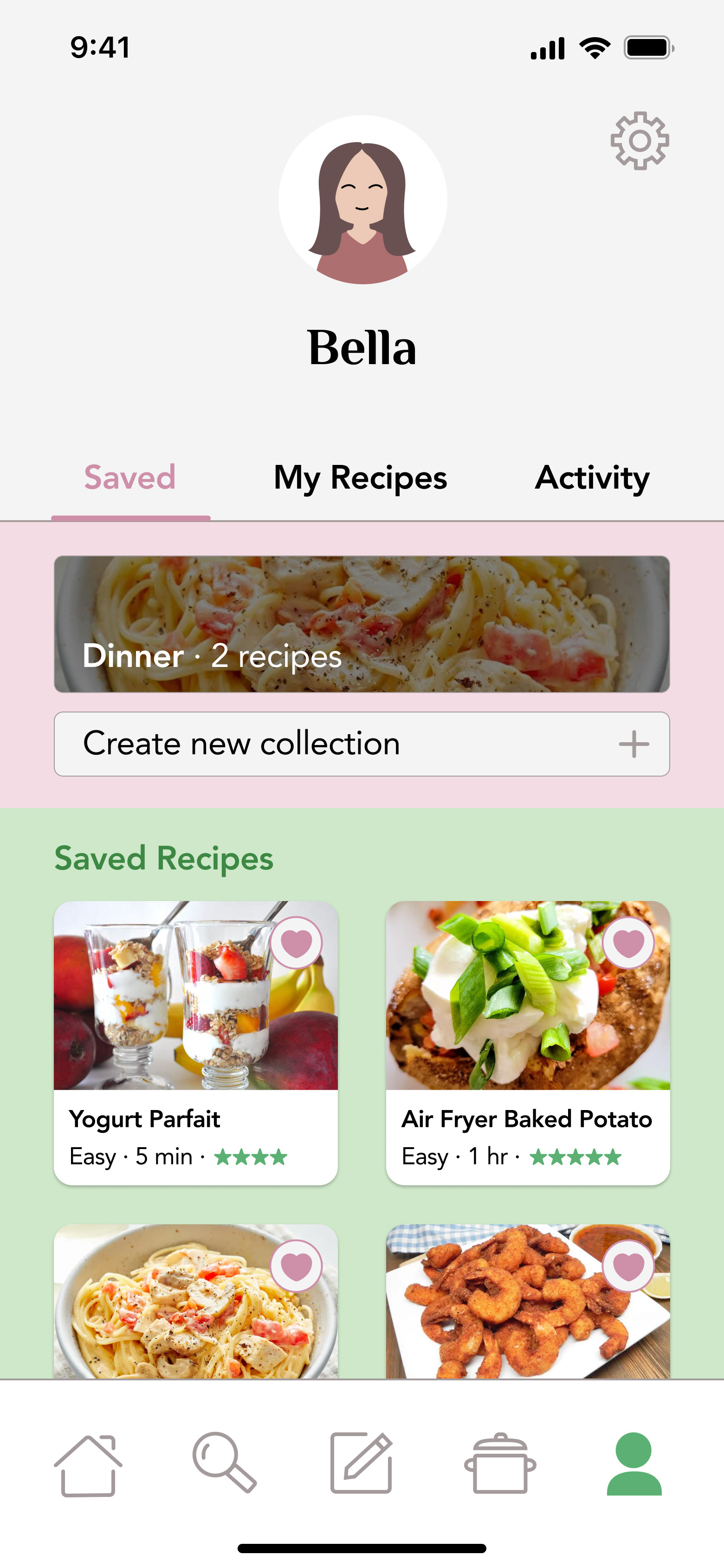
A video of the working prototype!
USER TESTING
I handed my prototype off to three individuals to test the functionality of my design. All three were able to navigate through the app seamlessly with little confusion, however, some issues were identified that could be addressed in another iteration:
1. Two people expressed there should be a back button for the questions in the onboarding flow.
2. One person expressed that progress should be shown during onboarding to show how many questions are left.
3. One person showed confusion about what would be found under the different tabs in the profile section.
4. One person showed confusion about whether liking a recipe would move it to the meal planner or saved recipes tab.
06. Reflection
TAKEAWAYS
This was my first time creating a project in Figma, so I loved being able to continuously learn new things along the way! I enjoyed using the design thinking process and trying to get into the minds of my target users to design something that many people could potentially find use in. Going forward, however, I'd try to conduct interviews instead of relying on a survey to identify user needs and pain points. I felt that my research slightly lacked the human-to-human connection that I've learned is crucial when it comes to designing products to solve problems. Regardless, I'm excited to continue my journey as a designer and explore even more from here.
